Widget "TabItem" represents a tab in widget "TabController".
For more information about container or child widgets, see Definition of container/child widgets.
The following properties cannot be used in compound widget "Mapping":
zIndex, left, height, width, imageHeight, imageWidth
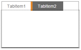
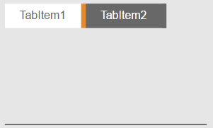
Appearance
|
|
Editor |
Web browser |
If more "TabItem" widgets are added than have space in one line of widget "TabControl", they will be reduced in size as far as possible until the tabs no longer have space in widget "TabControl".
Properties
Type |
Description |
Bindable |
Necessary |
Default value |
|
ellipsis |
Defines whether a text that is too long should be indicated by an ellipsis, e.g. "This text is..." instead of "This text is too long". For more information, see here. Defines whether a number that is too long should be indicated by an ellipsis, e.g. "12012 ..." instead of "120125100". Defines whether a number in the ValueDisplaybox that is too long should indicated by an ellipsis, e.g. "12..." instead of "12.000". If true, ellipses are applied; if false, the width of the ValueDisplaybox is adjusted exactly to the number width so that the whole number can be displayed. |
|
|
false |
|
Defines the usability of the widgets within "TabItem". If "enable=false", widget "TabItem" can be clicked. The widgets in the "TabItem" are disabled. |
|
|
true |
||
Relative path to an image that is shown in the widget. For more information, see here. |
|
|
|
||
imageHeight |
Defines the height of the image in the widget. |
|
|
0 |
|
imageWidth |
Defines the width of the image in the widget. |
|
|
0 |
|
imageAlign |
Position of the image relative to the text. For more information, see here. |
|
|
left |
|
mouseDownImage |
Relative path to an image that is shown as long as the widget is pressed. For more information, see here. |
|
|
|
|
multiLine |
Defines whether the text can be shown in multiple lines. If "wordWrap" has value true, a break is added to the text after a word or at an explicitly defined line break (\n) if necessary. For more information, see here. |
|
|
false |
|
permissionOperate |
Defines the roles that are permitted to use the widget. For roles without sufficient rights, the widget does not react to user interaction and does not trigger events. |
|
|
|
|
permissionView |
Defines the roles that are permitted to see the widget. For roles without sufficient rights, the widget is hidden. |
|
|
|
|
Reference to a customizable widget style. |
|
|
default |
||
Static text or a text from the text system that is shown on the widget. A localized text is defined by specifying $IAT/Textkey. |
|
|
|
||
Defines the visibility of the widget. The widget can be hidden with visible=false. (visible = true, hidden = false). The "visible" behavior is inherited from the container widget to the child widgets. |
|
|
true |
||
wordWrap |
Defines whether a break will be added to the text after a word if necessary. This option has no effect if "multiLine" is set to value false. For more information, see here. |
|
|
false |
|
zIndex determines the z-order of the widget. With overlapping widgets, the zIndex determines which widget is on the top and which one is on the bottom. The widget with the larger zIndex is on top, and the one with the smaller zIndex is on the bottom. The zIndex must be unique within a piece of content or a container widget. The zIndex is automatically assigned by the visual editor and can therefore be changed via the toolbar. |
|
|
|
||
left |
Applies an offset for the nominal position of the tab item. If a distance of 10px should be applied between items, for example, the following configuration should be used: First tab item: left="0" Second tab item: left="10" Third tab item: left="20" |
|
|
|
|
height |
Defines the total height of the widget in pixels. A value in % refers to the height of the surrounding element. |
|
|
30 |
|
width |
Defines the total width of the widget in pixels. A value in % refers to the width of the surrounding element. |
|
|
100 |
|
tooltip |
Defines the text that should appear as information when the tooltip indicator is pressed. A static text or a text from the text system can be used. For more information, see here. Mode "Tooltip" must be enabled for this. There are two different options for this: •Using action "ShowTooltip" •Using action "Client system" ShowTooltips. |
|
|
|
|
useSVGStyling |
Defines whether an SVG image is added to the widget as an "inline" or an "object". If useSVGStyling = true, SVG properties such as imageColor can be changed at runtime. However, this can affect performance on the client if the SVG image contains a lot of elements. If useSVGStyling = false, property imageColor is ignored but will be displayed faster at runtime. |
|
|
true |
|
tabIndex |
Property tabIndex is used to manage the tab order during keyboard operation. For additional information, see Keyboard operation. ENTER triggers event Click if tabIndex ≥0. It is not possible to operate widget TabItem with the keyboard. |
|
|
-1 |
Styleable properties
Type |
Description |
Default value |
|
borderStyle |
Defines the style of the border around the widget. Borders can be unbroken, dashed or dotted. |
solid |
|
borderWidth |
Defines the width of the border around the widget. |
2px |
|
cornerRadius |
Defines the corner style of the widget. |
5px 5px 0px 0px |
|
borderColor |
Defines the color of the border around the widget. |
#5B7C70 |
|
backColor |
Defines the background color of the widget. |
#DBDBDB |
|
backGroundGradient |
Defines the background color of the widget as a color gradient. |
|
|
textColor |
Defines the color used to display the text. |
#000000 |
|
activeBorderStyle |
Defines the style of the widget border during active operation. |
solid |
|
activeBorderWidth |
Defines the width of border around the widget during active operation. |
4px 2px 0px 2px |
|
activeCornerRadius |
Defines the style of the widget corners during active operation. |
0px |
|
activeBorderColor |
Defines the color of the border around the widget during operation. |
#FD7B01 #5B7C70 #5B7C70 #5B7C70 |
|
activeBackColor |
Defines the background color of a widget during operation. |
#FFFFFF |
|
activeBackGroundGradient |
Defines the background color of the widget as a color gradient during active operation. |
|
|
activeTextColor |
Defines the color used to display the text during operation. |
#000000 |
|
imageColor |
Defines the color of the image in the widget. This requires an SVG image whose color has not been set explicitly. |
#000000 |
|
mouseDownImageColor |
Defines the color of the image in the widget while the widget is pressed. This requires an SVG image whose color has not been set explicitly. |
#000000 |
|
textAlign |
Defines the orientation of the text. |
center |
|
opacity |
Defines the transparency of the widget. The lower the value, the more transparent the widget. |
1 |
|
fontSize |
Defines the size of the font used to display the text. |
12px |
|
fontName |
Defines the font used for the text shown. |
Arial |
|
bold |
Defines whether the text is shown in bold. |
true |
|
italic |
Defines whether the text is shown in italics. |
false |
|
margin |
Defines the offset of the external boundary of the widget to the widget's actual set position. For more information, see here. |
0px |
|
padding |
Defines the spacing between the outer boundary of the widget and its content. For more information, see here. |
0px 10px |