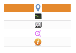
Widget "SequencerTableItemImageList" is used to provide the images for selecting commands.
|
How the widget can be styled is explained in use case Column styling. |
The following properties cannot be used in compound widget "Mapping":
zIndex
Appearance
|
|
Editor |
Web browser |
Properties
Type |
Description |
Binding |
Read only |
Necessary |
Default value |
|
Defines the column width. This property can overwrite property "columnWidth" of widget "Table" if the value is not equal to 0. This is only possible, however, if widget "TableItem" has been defined as a column. |
|
|
|
0 |
||
Defines the usability of the widget. A disabled widget (enable=false) does not react to user interaction and does not trigger events. The "enable" behavior is inherited from the container widgets to the child widgets. |
|
|
|
true |
||
List of images located at the specified path (imagePrefix). Displays a placeholder image until imageList and imagePrefix have been set. The array position (selectedIndex) defines the index of the image. Example: ['image1.png','image2.png'] |
|
|
|
|
||
imagePrefix |
Relative path to a folder containing images that should be placed on the widget. Displays a placeholder image until imageList and imagePrefix have been set. For more information, see here. |
|
|
|
|
|
permissionOperate |
Defines the roles that are permitted to use the widget. For roles without sufficient rights, the widget does not react to user interaction and does not trigger events. |
|
|
|
|
|
permissionView |
Defines the roles that are permitted to see the widget. For roles without sufficient rights, the widget is hidden. |
|
|
|
|
|
Defines the row height. This property can overwrite property "rowHeight" of widget "Table" if the value is not equal to 0. This is only possible, however, if widget "TableItem" has been defined as a line. |
|
|
|
0 |
||
Specifies the image index of a cell. If nothing is selected or the table updated, the return value is -1. |
|
|
|
0 |
||
Defines the images that are displayed in the table. A numeric array must be specified. The size of the array determines the number of cells. If selectedIndex[0] = 1, for example, then the image at index 1 of property imageList is displayed in the first cell. If imageList = ['image1.png','image2.png'], then image2.png will be displayed. |
|
|
|
|
||
Reference to a customizable widget style. |
|
|
|
default |
||
Defines the text in the header. |
|
|
|
|
||
Defines the visibility of the widget. The widget can be hidden with visible=false. (visible = true, hidden = false). The "visible" behavior is inherited from the container widget to the child widgets. |
|
|
|
true |
||
zIndex determines the z-order of the widget. With overlapping widgets, the zIndex determines which widget is on the top and which one is on the bottom. The widget with the larger zIndex is on top, and the one with the smaller zIndex is on the bottom. The zIndex must be unique within a piece of content or a container widget. The zIndex is automatically assigned by the visual editor and can therefore be changed via the toolbar. |
|
|
|
|
Styleable properties - Only configurable using a theme
Type |
Description |
Default value |
|
backColorEven |
Background color for even-numbered table entries in the row direction. |
Transparent |
|
backColorOdd |
Background color for unevenly numbered table entries in the row direction. |
Transparent |
|
backgroundGradientEven |
Background gradient for even-numbered table entries in the row direction. |
|
|
backgroundGradientOdd |
Background gradient for unevenly numbered table entries in the row direction. |
|
|
cellAlign |
Orientation of the text in a cell. |
center center |
|
cellBorderStyle |
Style of the table border. |
solid |
|
cellBorderColor |
Border color of a cell. |
#C8C8C8 |
|
cellBorderWidth |
Border width of a cell. |
0px 0px 1px 1px |
|
fontSize |
Defines the size of the font used to display the text. |
14px |
|
headerBackColor |
Text color for selected elements. |
#FCFCFC |
|
headerGradient |
Background gradient of the header. |
|
|
headerTextColor |
Text color of the header. |
#333333 |
|
headerFontSize |
Font size of the header. |
14px |
|
headerBold |
Defines whether text in the header is shown in bold. |
false |
|
headerItalic |
Defines whether text in the header line is displayed in italics. |
false |
|
textColorOdd |
Defines the color used to display text in odd-numbered table entries in the row direction. |
#333333 |
|
textColorEven |
Defines the color used to display text in even-numbered table entries in the row direction. |
#333333 |
|
bold |
Defines whether the text is shown in bold. |
false |
|
italic |
Defines whether the text is shown in italics. |
false |
|
sortingButtonColor |
Defines the color used to display the icons for sorting when not applied. |
#ECECEC |
|
sortingButtonActiveColor |
Defines the color used to display the icon for sorting when applied. |
#5F8DD3 |
|
cellPadding |
Defines the spacing between the outer boundary of the table entry and its content. For more information, see here. |
0px |
|
headerCellPadding |
Defines the spacing between the outer boundary of the header entry and its contents. For more information, see here. |
0px |

