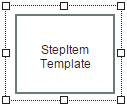
Widget "SequencerStepItem" represents a step in a sequence.
The following properties cannot be used in compound widget "Mapping":
zIndex, left, top, height, width
Appearance
|
|
Editor |
Web browser |
Properties
Type |
Description |
Bindable |
Necessary |
Default value |
|
imageAlign |
Position of the image relative to the text. For more information, see here. |
|
|
top |
|
Reference to a customizable widget style. |
|
|
default |
||
left |
Absolute position measured from the left border of the surrounded element (e.g. container widget or content). |
|
|
|
|
top |
Absolute position measured from the top border of the surrounded element (e.g. container widget or content). |
|
|
|
|
width |
Defines the total width of the widget in pixels. A value in % refers to the width of the surrounding element. |
|
|
100 |
|
height |
Defines the total height of the widget in pixels. A value in % refers to the height of the surrounding element. |
|
|
80 |
|
zIndex determines the z-order of the widget. With overlapping widgets, the zIndex determines which widget is on the top and which one is on the bottom. The widget with the larger zIndex is on top, and the one with the smaller zIndex is on the bottom. The zIndex must be unique within a piece of content or a container widget. The zIndex is automatically assigned by the visual editor and can therefore be changed via the toolbar. |
|
|
|
Styleable properties
All styleable properties must be specified using a .style file. The styleable properties cannot be modified here. For more information, see Structure of widget "SequencerStepItem".
Type |
Description |
Default value |
|
textAlign |
Defines the orientation of the text. |
center |
|
borderStyle |
Defines the style of the border around the widget. Borders can be unbroken, dashed or dotted. |
solid |
|
borderWidth |
Defines the width of the border around the widget. |
2px |
|
cornerRadius |
Defines the corner style of the widget. |
0px |
|
backColor |
Defines the background color of the widget. |
#DBDBDB |
|
activeBackColor |
Defines the background color of a widget during operation. |
#DBDBDB |
|
textColor |
Defines the color used to display the text. |
#000000 |
|
activeTextColor |
Defines the color used to display the text during operation. |
#000000 |
|
disabledTextColor |
Defines the color of the text in the disabled state. |
#989898 |
|
fontSize |
Defines the size of the font used to display the text. |
12px |
|
fontName |
Defines the font used for the text shown. |
Arial |
|
bold |
Defines whether the text is shown in bold. |
false |
|
italic |
Defines whether the text is shown in italics. |
false |
|
disabledBackColor |
Defines the background color of the widget in the disabled state. |
#F1F1F1 |
|
backGroundGradient |
Defines the background color of the widget as a color gradient. |
|
|
activeBackGroundGradient |
Defines the background color of the widget as a color gradient during active operation. |
|
|
disabledBackGroundGradient |
Defines the background color of the widget as a color gradient in the disabled state. |
|
|
backGround |
Defines a relative path to an image to be used as the background. |
|
|
borderColor |
Defines the color of the border around the widget. |
#5B7C70 |
|
activeBorderColor |
Defines the color of the border around the widget during operation. |
#FF8800 |
|
disabledBorderColor |
Defines the color of the border around the widget in the disabled state. |
#FFFFFF #C8C8C8 #C8C8C8 #FFFFFF |
|
opacity |
Defines the transparency of the widget. The lower the value, the more transparent the widget. |
1 |
|
padding |
Defines the spacing between the outer boundary of the widget and its content. For more information, see here. |
0px |
|
margin |
Defines the offset of the external boundary of the widget to the widget's actual set position. For more information, see here. |
0px |
|
shadow |
Defines the shadow of the widget. |
none |

