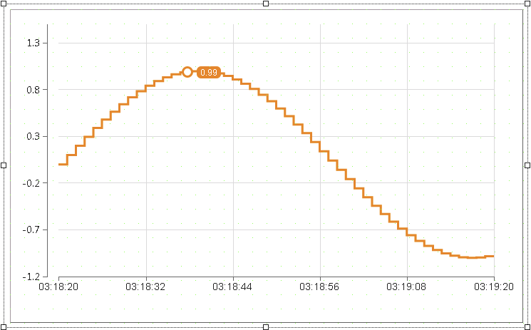
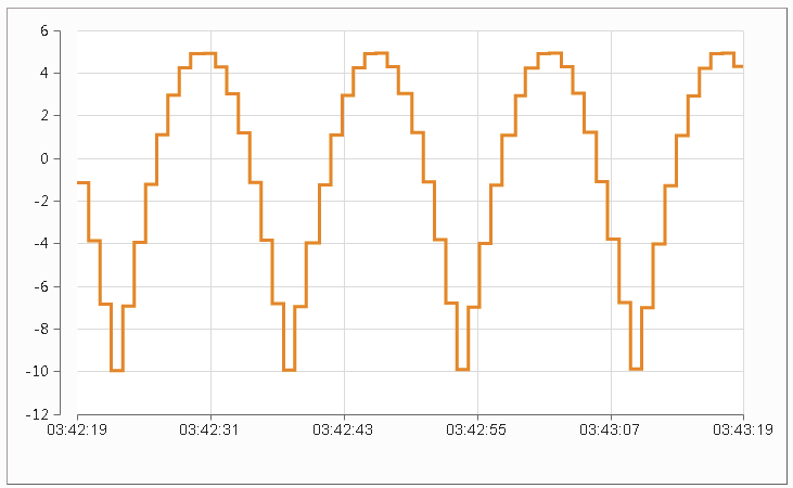
Widget "OnlineChartHDA" is used to visually display current OPC UA HDA (Historical Data Access) data and online data.
For a description of how the widget can be configured, see here.
See page Interacting with the widget for a more detailed explanation of further actions.
|
Our B&R Tutorial Portal includes a tutorial on widget OnlineChartHDA (GER/ENG). (Access data) |
Appearance
|
|
Editor |
Web browser |
Properties
Type |
Description |
Bindable |
Necessary |
Default value |
|
Defines the usability of the widget. A disabled widget (enable=false) does not react to user interaction and does not trigger events. The "enable" behavior is inherited from the container widgets to the child widgets. |
|
|
true |
||
permissionOperate |
Defines the roles that are permitted to use the widget. For roles without sufficient rights, the widget does not react to user interaction and does not trigger events. |
|
|
|
|
permissionView |
Defines the roles that are permitted to see the widget. For roles without sufficient rights, the widget is hidden. |
|
|
|
|
Reference to a customizable widget style. |
|
|
default |
||
tooltip |
Defines the text that should appear as information when the tooltip indicator is pressed. You can use a static text or a text from the text system. For more information, see here. Mode "Tooltip" must be enabled for this. There are two different options for this: •Using action "ShowTooltip" •Using action "Client system" ShowTooltips. |
|
|
|
|
updateBufferTime |
Defines the interval at which the historical data is updated in ms. If the value is 0, the historical data is only used once (initial). Only online data is used after that. |
|
|
2000 |
|
updateChartTime |
Defines the interval in ms in which the graph is redrawn (updated). |
|
|
200 |
|
Defines the visibility of the widget. The widget can be hidden with visible=false. (visible = true, hidden = false). The "visible" behavior is inherited from the container widget to the child widgets. |
|
|
true |
||
Defines that axes that zooming should be possible for. |
|
|
xy |
||
zIndex determines the z-order of the widget. With overlapping widgets, the zIndex determines which widget is on the top and which one is on the bottom. The widget with the larger zIndex is on top, and the one with the smaller zIndex is on the bottom. The zIndex must be unique within a piece of content or a container widget. The zIndex is automatically assigned by the visual editor and can therefore be changed via the toolbar. |
|
|
|
||
left |
Absolute position measured from the left border of the surrounded element (e.g. container widget or content). |
|
|
|
|
top |
Absolute position measured from the top border of the surrounded element (e.g. container widget or content). |
|
|
|
|
height |
Defines the total height of the widget in pixels. A value in % refers to the height of the surrounding element. |
|
|
440 |
|
width |
Defines the total width of the widget in pixels. A value in % refers to the width of the surrounding element. |
|
|
720 |
|
tabIndex |
Property tabIndex is used to manage the tab order during keyboard operation. For additional information, see Keyboard operation. ENTER triggers event Click if tabIndex ≥0. Operating widget OnlineChartHDA with the keyboard must be done via the corresponding actions (e.g. in event Click of a button for scrolling). |
|
|
-1 |
Collections
A collection describes a grouping of properties that summarizes a component of widget "OnlineChartHDA". The widget has four collections: the cursor, graph, x-axis and y-axis.
These grouped properties can be configured in a separate collection dialog box.
Type |
Description |
minSize |
maxSize |
|
cursor |
Defines the appearance and behavior of the cursor for data analysis. |
1 |
1 |
|
graph |
Defines the appearance and behavior of the data to be displayed that is bound here. |
1 |
8 |
|
xAxis |
Defines the appearance and behavior of the x-axis. |
1 |
1 |
|
yAxis |
Defines the appearance and behavior of the y-axis. |
1 |
5 |
Styleable properties
Type |
Description |
Default value |
|
backColor |
Defines the background color of the widget. |
#DBDBDB |
|
borderWidth |
Defines the width of the border around the widget. |
0px |
|
borderColor |
Defines the color of the border around the widget. |
#000000 |
|
borderStyle |
Defines the style of the border around the widget. Borders can be unbroken, dashed or dotted. |
solid |
|
chartColor |
Defines the color of the graph area in the widget. |
#FFFFFF |
|
disabledChartColor |
Defines the color for the graph area of the widget in the disabled state. |
#F0F0F0 |

