Widget "ListBox" shows a list from which the user can select an element.
|
For this widget, there is a use case that explains how the widget can be used. |
The following properties cannot be used in compound widget "Mapping":
zIndex, left, top, height, width
Appearance
|
|
Editor |
Web browser |

Properties
Type |
Description |
Bindable |
Necessary |
Default value |
|
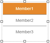
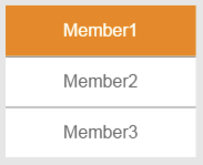
Defines the entries in the list. "dataProvider" is composed of a value and optional text for each entry. e.g. [{'value':'4','text':'Member1'},{'value':'2','text':'Member2'},{'value':'1','text':'Member3'}]; With this example, the list would look like this: |
|
|
|
||
ellipsis |
Defines whether a text that is too long should be indicated by an ellipsis, e.g. "This text is..." instead of "This text is too long". For more information, see here. |
|
|
false |
|
Defines the usability of the widget. A disabled widget (enable=false) does not react to user interaction and does not trigger events. The "enable" behavior is inherited from the container widgets to the child widgets. |
|
|
true |
||
fitHeight2Items |
Defines whether the height of the widget should be automatically adjusted to the content. true: The widget ignores its surroundings and attempts to show the entire content. false: The widget defines the height of the list using property height. |
|
|
false |
|
imageAlign |
Position of the image relative to the text. For more information, see here. |
|
|
left |
|
imagePath |
Path to a list of images that can be displayed on the entries (e.g. 'Media/images/'). The names of the images must match the indices of dataProvider (e.g. 0.png, 1.png, 2.png) in order to display an image on the associated entry. |
|
|
|
|
itemHeight |
Height of the elements in the list. |
|
|
40 |
|
multiLine |
Defines whether the text can be shown in multiple lines. If "wordWrap" has value true, a break is added to the text after a word or at an explicitly defined line break (\n) if necessary. For more information, see here. |
|
|
false |
|
permissionOperate |
Defines the roles that are permitted to use the widget. For roles without sufficient rights, the widget does not react to user interaction and does not trigger events. |
|
|
|
|
permissionView |
Defines the roles that are permitted to see the widget. For roles without sufficient rights, the widget is hidden. |
|
|
|
|
Defines the index of the list entry to be selected. The first entry has index 0. |
|
|
0 |
||
The value defined using property dataProvider for the selected element as a string. |
|
|
|
||
Reference to a customizable widget style. |
|
|
default |
||
Defines the visibility of the widget. The widget can be hidden with visible=false. (visible = true, hidden = false). The "visible" behavior is inherited from the container widget to the child widgets. |
|
|
true |
||
wordWrap |
Defines whether a break will be added to the text after a word if necessary. This option has no effect if "multiLine" is set to value false. For more information, see here. |
|
|
false |
|
zIndex determines the z-order of the widget. With overlapping widgets, the zIndex determines which widget is on the top and which one is on the bottom. The widget with the larger zIndex is on top, and the one with the smaller zIndex is on the bottom. The zIndex must be unique within a piece of content or a container widget. The zIndex is automatically assigned by the visual editor and can therefore be changed via the toolbar. |
|
|
|
||
left |
Absolute position measured from the left border of the surrounded element (e.g. container widget or content). |
|
|
|
|
top |
Absolute position measured from the top border of the surrounded element (e.g. container widget or content). |
|
|
|
|
height |
Defines the total height of the widget in pixels. A value in % refers to the height of the surrounding element. |
|
|
150 |
|
width |
Defines the total width of the widget in pixels. A value in % refers to the width of the surrounding element. |
|
|
150 |
|
displaySettings |
Defines which elements (text/images) are displayed by the widget. |
|
|
default |
|
tooltip |
Defines the text that should appear as information when the tooltip indicator is pressed. You can use a static text or a text from the text system. For more information, see here. Mode "Tooltip" must be enabled for this. There are two different options for this: •Using action "ShowTooltip" •Using action "Client system" ShowTooltips. |
|
|
|
|
tabIndex |
Property tabIndex is used to manage the tab order during keyboard operation. For additional information, see Keyboard operation. ENTER triggers event Click when tabIndex ≥0 and selects the focused element. According to the OnStart configuration in the HMI application, it is possible to navigate in the list and apply the selection according to OnEnd. |
|
|
0 |
Styleable properties
Type |
Description |
Default value |
|
borderWidth |
Defines the width of the border around the widget. |
2px |
|
borderStyle |
Defines the style of the border around the widget. Borders can be unbroken, dashed or dotted. |
solid |
|
cornerRadius |
Defines the corner style of the widget. |
0px |
|
backColor |
Defines the background color of the widget. |
#FFFFFF |
|
backGroundGradient |
Defines the background color of the widget as a color gradient. |
|
|
borderColor |
Defines the color of the border around the widget. |
#535353 |
|
textColor |
Defines the color used to display the text. |
#535353 |
|
activeBackColor |
Defines the background color of the selected element. |
#ff8800 |
|
activeBackGroundGradient |
Defines the background color of the selected element as a color gradient. |
|
|
activeTextColor |
Defines the color used to display the selected text. |
#ffffff |
|
textAlign |
Defines the orientation of the text. |
center |
|
opacity |
Defines the transparency of the widget. The lower the value, the more transparent the widget. |
1 |
|
fontSize |
Defines the size of the font used to display the text. |
12px |
|
fontName |
Defines the font used for the text shown. |
Arial |
|
bold |
Defines whether the text is shown in bold. |
true |
|
italic |
Defines whether the text is shown in italics. |
false |
|
margin |
Defines the offset of the external boundary of the widget to the widget's actual set position. For more information, see here. |
0px |
|
listSeparatorColor |
Defines the color of the dividing line between the list entries. |
#000 |
|
padding |
Defines the spacing between the outer boundary of the header entry and its contents. For more information, see here. |
0px 15px |