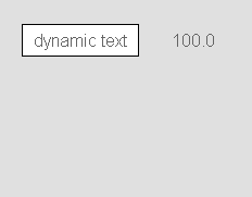
Widget "FlexLayoutPanel" allows a grouping of widgets whose size is defined by the content to be displayed. By nesting several FlexLayoutPanel instances, grouped widgets can be displayed as a table.
It is a container for the widgets that have data type "AutoSize" for properties "height" and "width". They can be placed in the FlexLayoutPanel for dynamic sizing.
For more information about container or child widgets, see Definition of container/child widgets.
The size adjustment function of widget "FlexLayoutPanel" only works with widgets whose width or height property is set to value "auto".
If the size is changed due to a change in the content to be displayed, the positions and dimensions calculated by the system are not updated. Affected are already-displayed tooltips, scroll bars as well as the position of dialog boxes that were opened using client system action "OpenDialogAtTarget".
The following properties cannot be used in compound widget "Mapping":
zIndex, left, top, height, width, maxHeight, minHeight, maxWidth, minWidth
Appearance
|
|
Editor |
Web browser |
Properties
Type |
Description |
Bindable |
Necessary |
Default value |
|
permissionOperate |
Defines the roles that are permitted to use the widget. For roles without sufficient rights, the widget does not react to user interaction and does not trigger events. |
|
|
|
|
permissionView |
Defines the roles that are permitted to see the widget. For roles without sufficient rights, the widget is hidden. |
|
|
|
|
Defines the usability of the widget. A disabled widget (enable=false) does not react to user interaction and does not trigger events. The "enable" behavior is inherited from the container widgets to the child widgets. |
|
|
True |
||
Defines the visibility of the widget. The widget can be hidden with visible=false. (visible = true, hidden = false). The "visible" behavior is inherited from the container widget to the child widgets. |
|
|
True |
||
Reference to a customizable widget style. |
|
|
default |
||
zIndex determines the z-order of the widget. With overlapping widgets, the zIndex determines which widget is on the top and which one is on the bottom. The widget with the larger zIndex is on top, and the one with the smaller zIndex is on the bottom. The zIndex must be unique within a piece of content or a container widget. The zIndex is automatically assigned by the visual editor and can therefore be changed via the toolbar. |
|
|
|
||
left |
Absolute position measured from the left border of the surrounded element (e.g. container widget or content). |
|
|
|
|
top |
Absolute position measured from the top border of the surrounded element (e.g. container widget or content). |
|
|
|
|
height |
Defines the total height of the widget in pixels. A value in % refers to the height of the surrounding element.If the value is set to "auto", the height is defined by the contents. |
|
|
150 |
|
width |
Defines the total width of the widget in pixels. A value in % refers to the width of the surrounding element.If the value is set to "auto", the width is defined by the contents. |
|
|
200 |
|
minWidth |
Defines the minimum total width of the widget. This property is applied if width="auto". Value 0 has no effect. |
|
|
0 |
|
maxWidth |
Defines the maximum total width of the widget. This property is applied if width="auto". Value 0 has no effect. |
|
|
0 |
|
minHeight |
Defines the minimum total height of the widget. This property is applied if height="auto". Value 0 has no effect. |
|
|
0 |
|
maxHeight |
Defines the maximum size of the widget. This property is applied if height="auto". Value 0 has no effect. |
|
|
0 |
|
tabIndex |
Property tabIndex is used to manage the tab order during keyboard operation. For additional information, see Keyboard operation. ENTER triggers event Click if tabIndex ≥0. |
|
|
-1 |
Styleable properties
type |
description |
defaultValue |
|
alignment |
Orientation of the widget elements. Possible values: -horizontal: Elements are arranged from left to right. -vertical: Elements are arranged from top to bottom. |
horizontal |
|
childMainAlign |
Defines the alignment of the elements depending on property "alignment". Possible values: start, center, end. Example: alignment=horizontal and childMainAlign=start → Elements are aligned horizontally to the left. alignment = vertical and childMainAlign = start → Elements are aligned vertically upwards. For more information, see Concept. |
start |
|
childCrossAlign |
Defines the complementary alignment of the elements depending on property "alignment". Possible values: start, center, end. Example: alignment=horizontal and childCrossAlign=start → Elements are aligned vertically upwards. alignment = vertical and childCrossAlign=start → Elements are aligned horizontally to the left. For more information, see Concept. |
start |
|
margin |
Defines the offset of the external boundary of the widget to the widget's actual set position. For more information, see here. |
10px |
|
padding |
Defines the spacing between the outer boundary of the widget and its content. For more information, see here. |
10px |

