This section includes detailed information for the concept of widget "FlexLayoutPanel".
Widget "FlexLayoutPanel" is used to display widgets with a flexible size. Widgets can adjust their text length, number length or image size, for example.
The following widgets support the auto-size function and can be added to FlexLayoutPanel: Buttons, FlexLayoutPanel, DateTimeOutput, Image, LoginButton, LoginInfo, LogoutButton, NumericOutput, Label, TextOutput.
The alignment of widgets within "FlexLayoutPanel" can be set as needed.
Adjusting size dynamically to content when switching languages
The length of the text may vary depending on the language selected. "FlexLayoutPanel" allows the internal widgets to dynamically increase or decrease in size depending on the text length so that no text is cut off or other widgets are hidden. All positions of the other widgets within widget "FlexLayoutPanel" are adjusted.
Step 1: Place the widgets.
First, "FlexLayoutPanel" is placed from the Widget Catalog onto the piece of content. The widgets listed above can then be added as needed. In this example, a label widget and button widget are added.
2nd step: Adjust the size properties.
So that the added widgets automatically adjust their size, property width must be set to "auto".
It is also possible to set the height to "auto"; the widget will then only be as big as necessary to display the whole text.
3rd step: Create and bind the text keys.
Next, the desired texts are added to a TMX file.
The desired text key is bound to property text.
Results:
When switching languages, the length and position of the widgets automatically adapt to the text.
Language=German |
Language=English |
Language=French |
|
|
|
The button and label widget change the size and position so that the whole text can be displayed. |
||
Aligning elements
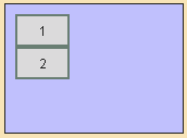
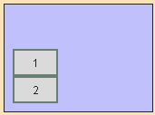
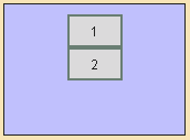
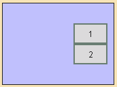
Properties alignment, childMainAlign and childCrossAlign influence the alignment of the child elements in "FlexLayoutPanel".
Example: alignment= horizontal
childMainAlign=start / childCrossAlign=start (default) |
childMainAlign=center / childCrossAlign=center |
|
|
|
|
childMainAlign=start / childCrossAlign=end |
childMainAlign=end / childCrossAlign=start |
|
Example: alignment=vertical


