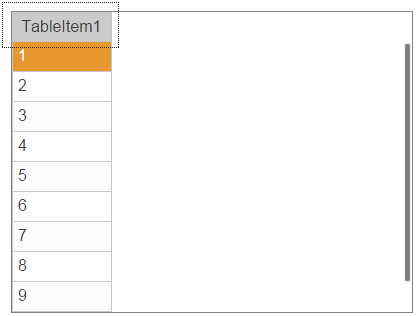
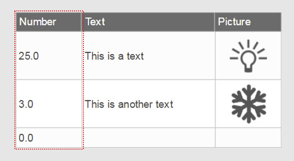
Widget "TableItem" defines a column or row in a table. It can be set to display either a numerical or string value.
Widget "Table" must be added first in order to use widget "TableItem".
When connecting variables under property category "Data", make sure that either a string array or numeric array is bound. Otherwise, nothing will be displayed in the column but the title of the TableItem.
|
How the widget can be styled is explained in use case Column styling. |
The following properties cannot be used in compound widget "Mapping":
zIndex
Appearance
|
|
Editor |
Web browser |
Properties
Type |
Description |
Binding |
Necessary |
Default value |
|
Defines the column width. This property can overwrite property "columnWidth" of widget "Table" if the value is not equal to 0. This is only possible, however, if widget "TableItem" has been defined as a column. |
|
|
0 |
||
Defines the usability of the widget. A disabled widget (enable=false) does not react to user interaction and does not trigger events. The "enable" behavior is inherited from the container widgets to the child widgets. |
|
|
true |
||
Defines the number format for the widget. |
|
|
{'metric':{ 'decimalPlaces' : 1, 'minimumIntegerDigits' : 1 }, 'imperial' :{ 'decimalPlaces' : 1, 'minimumIntegerDigits' : 1 }, 'imperial-us' :{ 'decimalPlaces' : 1, 'minimumIntegerDigits' : 1 }} |
||
input |
If true, data can be entered in a table entry. |
|
|
false |
|
inputStyle |
Style of the numeric pad being used. |
|
|
default |
|
limitViolationPolicy |
If a value is entered in a table that is outside defined limits, "limitViolationPolicy" can be used to define how to handle this out of range violation. |
|
|
noSubmit |
|
maxLength |
Defines the maximum number of characters that can be entered. If undefined, there is no limit. |
|
|
100 |
|
maxValue |
Defines the maximum permissible value for value binding. With node binding, the "high" attribute for the EU range from the OPC UA variable is used. |
|
|
100 |
|
minValue |
Defines the minimum permissible value for value binding. With node binding, the "low" attribute for the EU range from the OPC UA variable is used. |
|
|
0 |
|
Binding for numeric arrays with a unit. Note: Only an array binding is permitted. |
|
|
|
||
permissionOperate |
Defines the roles that are permitted to use the widget. For roles without sufficient rights, the widget does not react to user interaction and does not trigger events. |
|
|
|
|
permissionView |
Defines the roles that are permitted to see the widget. For roles without sufficient rights, the widget is hidden. |
|
|
|
|
Defines the row height. This property can overwrite property "rowHeight" of widget "Table" if the value is not equal to 0. This is only possible, however, if widget "TableItem" has been defined as a line. |
|
|
0 |
||
showUnit |
If true, the unit symbol is shown in the header. Defines whether the unit symbol (e.g. °C) is displayed in the header. (display = true, do not display = false) |
|
|
false |
|
Binding for string arrays. Note: Only an array binding is permitted. |
|
|
|
||
Reference to a customizable widget style. |
|
|
default |
||
Defines the text in the header. |
|
|
|
||
Defines the unit code of the widget. |
|
|
|
||
useDigitGrouping |
Defines whether number grouping should take place. If useDigitGrouping = true, the number 100000 will become 100,000, for example. |
|
|
true |
|
Binding for numeric arrays. Note: Only an array binding is permitted. |
|
|
|
||
Defines the visibility of the widget. The widget can be hidden with visible=false. (visible = true, hidden = false). The "visible" behavior is inherited from the container widget to the child widgets. |
|
|
true |
||
zIndex determines the z-order of the widget. With overlapping widgets, the zIndex determines which widget is on the top and which one is on the bottom. The widget with the larger zIndex is on top, and the one with the smaller zIndex is on the bottom. The zIndex must be unique within a piece of content or a container widget. The zIndex is automatically assigned by the visual editor and can therefore be changed via the toolbar. |
|
|
|
Styleable properties - Only configurable using a theme
Type |
Description |
Default value |
|
backColorEven |
Background color for even-numbered table entries in the row direction. |
Transparent |
|
backColorOdd |
Background color for unevenly numbered table entries in the row direction. |
Transparent |
|
backgroundGradientEven |
Background gradient for even-numbered table entries in the row direction. |
|
|
backgroundGradientOdd |
Background gradient for unevenly numbered table entries in the row direction. |
|
|
cellAlign |
Orientation of the text in a cell. |
center center |
|
cellBorderStyle |
Style of the table border. |
solid |
|
cellBorderColor |
Border color of a cell. |
#C8C8C8 |
|
cellBorderWidth |
Border width of a cell. |
0px 0px 1px 1px |
|
fontSize |
Defines the size of the font used to display the text. |
14px |
|
headerBackColor |
Text color for selected elements. |
#FCFCFC |
|
headerGradient |
Background gradient of the header. |
|
|
headerTextColor |
Text color of the header. |
#333333 |
|
headerFontSize |
Font size of the header. |
14px |
|
headerBold |
Defines whether text in the header is shown in bold. |
false |
|
headerItalic |
Defines whether text in the header line is displayed in italics. |
false |
|
textColorOdd |
Defines the color used to display text in odd-numbered table entries in the row direction. |
#333333 |
|
textColorEven |
Defines the color used to display text in even-numbered table entries in the row direction. |
#333333 |
|
bold |
Defines whether the text is shown in bold. |
false |
|
italic |
Defines whether the text is shown in italics. |
false |
|
sortingButtonColor |
Defines the color used to display the icons for sorting when not applied. |
#ECECEC |
|
sortingButtonActiveColor |
Defines the color used to display the icon for sorting when applied. |
#5F8DD3 |
|
cellPadding |
Defines the spacing between the outer boundary of the table entry and its content. For more information, see here. |
0px |
|
headerCellPadding |
Defines the spacing between the outer boundary of the header entry and its contents. For more information, see here. |
0px |

