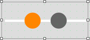
Widget "RangeSlider" allows a value to be changed using two horizontal or vertical slider thumbs.
This provides the possibility of changing the limits (EU range) of an OPC UA variable with only one widget, for example.
The following properties cannot be used in compound widget "Mapping":
zIndex, left, top, height, width
Appearance
|
|
Editor |
Web browser |
Properties
Type |
Description |
Bindable |
Necessary |
Default value |
|
changeOnMove |
Specifies whether the new value should be sent to the server immediately when the slider thumb is moved. If true, the value is sent to the server immediately. If false, only when the widget is released (no longer being pressed, property "MouseUp"). |
|
|
true |
|
Defines the usability of the widget. A disabled widget (enable=false) does not react to user interaction and does not trigger events. The "disabled..." style is displayed at runtime. The "enable" behavior is inherited from the container widgets to the child widgets. |
|
|
true |
||
Defines the number format for the widget. |
|
|
{'metric':{ 'decimalPlaces' : 1, 'minimumIntegerDigits' : 1 }, 'imperial' :{ 'decimalPlaces' : 1, 'minimumIntegerDigits' : 1 }, 'imperial-us' :{ 'decimalPlaces' : 1, 'minimumIntegerDigits' : 1 }} |
||
minThumbImage |
Relative path to an image displayed on the slider thumb (responsible for the minimum value). For more information, see here. |
|
|
|
|
maxThumbImage |
Relative path to an image displayed on the slider thumb (responsible for the maximum value). For more information, see here. |
|
|
|
|
majorTicks |
Defines how many subdivisions of the slider track are displayed. The starting and end values are not included. |
|
|
5 |
|
maxValue |
Defines the maximum permissible value for value binding. With node binding, the "high" attribute for the EU range from the OPC UA variable is used. |
|
|
100 |
|
minValue |
Defines the minimum permissible value for value binding. With node binding, the "low" attribute for the EU range from the OPC UA variable is used. |
|
|
0 |
|
This property can be used to bind a numerical value. The value changes depending on the position of the slider thumb (responsible for the minimum value). |
|
|
30 |
||
Value with unit for node binding. The value changes depending on the position of the movement element (responsible for the minimum value). |
|
|
|
||
This property can be used to bind a numerical value. The value changes depending on the position of the movement element (responsible for the maximum value). |
|
|
70 |
||
Value with unit for node binding. The value changes depending on the position of the movement element (responsible for the maximum value). |
|
|
|
||
orientation |
Defines the orientation of the widget. |
|
|
LeftToRight |
|
permissionOperate |
Defines the roles that are permitted to use the widget. For roles without sufficient rights, the widget does not react to user interaction and does not trigger events. |
|
|
|
|
permissionView |
Defines the roles that are permitted to see the widget. For roles without sufficient rights, the widget is hidden. |
|
|
|
|
scaleOffset |
Defines the distance of the lower part of the graph or scale to the slider track. |
|
|
15px |
|
showUnit |
Defines whether the unit should be displayed. A node binding is necessary for this. |
|
|
false |
|
showValueDisplay |
Defines whether the value and unit should be displayed. Display value = true / Do not display value = false. |
|
|
false |
|
Reference to a customizable widget style. |
|
|
Default |
||
thumbSize |
Defines the size of the two slider thumbs. |
|
|
50px |
|
tickPosition |
Defines whether the graphic area or scale should be shown above or below the slider track. Possible values: bottom: The scale is displayed below the slider track. none: The scale is not displayed. top: The scale is displayed above the slider track. topbottom: The scale is displayed above and below the slider track. |
|
|
none |
|
showTickNumbers |
Defines whether the subdivision of the slider track is displayed not only graphically via dashes but also numerically using a value scale. Value scale = true / No value scale, only graphics = false. Property "tickPosition" is not permitted to equal "none" here. |
|
|
false |
|
trackSize |
Defines the width of the slider track. |
|
|
7px |
|
Defines the unit code of the widget. |
|
|
|
||
valueDisplaySize |
Defines the font size of the displayed value. Property "showValueDisplay" must be set to true for this. |
|
|
35px |
|
Defines the visibility of the widget. The widget can be hidden with visible=false. (visible = true, hidden = false). The "visible" behavior is inherited from the container widget to the child widgets. |
|
|
true |
||
zIndex determines the z-order of the widget. With overlapping widgets, the zIndex determines which widget is on the top and which one is on the bottom. The widget with the larger zIndex is on top, and the one with the smaller zIndex is on the bottom. The zIndex must be unique within a piece of content or a container widget. The zIndex is automatically assigned by the visual editor and can therefore be changed via the toolbar. |
|
|
|
||
left |
Absolute position measured from the left border of the surrounded element (e.g. container widget or content). |
|
|
|
|
top |
Absolute position measured from the top border of the surrounded element (e.g. container widget or content). |
|
|
|
|
height |
Defines the total height of the widget in pixels. A value in % refers to the height of the surrounding element. |
|
|
100 |
|
width |
Defines the total width of the widget in pixels. A value in % refers to the width of the surrounding element. |
|
|
250 |
|
ellipsis |
Defines whether a number in the ValueDisplaybox that is too long should indicated by an ellipsis, e.g. "12..." instead of "12.000". If true, ellipses are applied; if false, the width of the ValueDisplaybox is adjusted exactly to the number width so that the whole number can be displayed. |
|
|
true |
|
tooltip |
Defines the text that should appear as information when the tooltip indicator is pressed. You can use a static text or a text from the text system. For more information, see here. Mode "Tooltip" must be enabled for this. There are two different options for this: •Using action "ShowTooltip" •Using action "Client system" ShowTooltips. |
|
|
|
|
tabIndex |
Property tabIndex is used to manage the tab order during keyboard operation. For additional information, see Keyboard operation. ENTER triggers events MouseDown, MouseUp and Click for tabIndex ≥0. It is not possible to operate the thumb with the keyboard. |
|
|
-1 |
Styleable properties
Type |
Description |
Default value |
|
backColor |
Defines the background color of the widget. |
Transparent |
|
backGroundGradient |
Defines the background color of the widget as a color gradient. |
|
|
borderColor |
Defines the color of the border around the widget. |
#000000 |
|
borderStyle |
Defines the style of the border around the widget. Borders can be unbroken, dashed or dotted. |
solid |
|
borderWidth |
Defines the width of the border around the widget. |
0px |
|
cornerRadius |
Defines the corner style of the widget. |
0px |
|
minThumbColor |
Defines the background color of the slider thumb (responsible for the minimum value). |
#FF8800 |
|
minThumbGradient |
Defines the background color of the slider thumb (responsible for the minimum value) as a color gradient. |
|
|
maxThumbColor |
Defines the background color of the slider thumb (responsible for the maximum value). |
#FF8800 |
|
maxThumbGradient |
Defines the background color of the slider thumb (responsible for the maximum value) as a color gradient. |
|
|
trackColor |
Defines the background color of the widget's slider track. |
#C8C8C8 |
|
trackGradient |
Defines the background color of the slider track for widget "BasicSlider" as a color gradient. |
|
|
fillColor |
Defines the background color of the slider track between the two slider thumbs. |
Transparent |
|
fillGradient |
Defines the background color of the slider track between the two slider thumbs as a color gradient. |
|
|
disabledBackColor |
Defines the background color of the widget in the disabled state. |
Transparent |
|
disabledBackGroundGradient |
Defines the background color of the widget as a color gradient in the disabled state. |
|
|
disabledMinThumbColor |
Defines the background color of the slider thumb (responsible for the minimum value) in the disabled state. |
#F1F1F1 |
|
disabledMinThumbGradient |
Defines the background color of the slider thumb (responsible for the minimum value) as a color gradient in the disabled state. |
|
|
disabledMaxThumbColor |
Defines the background color of the slider thumb (responsible for the maximum value) in the disabled state. |
#F1F1F1 |
|
disabledMaxThumbGradient |
Defines the background color of the slider thumb (responsible for the maximum value) as a color gradient in the disabled state. |
|
|
disabledTrackColor |
Defines the background color of the widget's slider track in the disabled state. |
#EAEAEA |
|
disabledTrackGradient |
Defines the background color of the slider track of widget "RangeSlider" in the disabled state as a color gradient. |
|
|
disabledFillColor |
Defines the background color used for the slider track between the two slider thumbs in the disabled state. |
Transparent |
|
disabledFillGradient |
Defines the background color used for the slider track between the two slider thumbs as a color gradient in the disabled state. |
|
|
fontSize |
Defines the size of the font used to display the text. |
10px |
|
fontName |
Defines the font used for the text shown. |
Arial |
|
margin |
Defines the offset of the external boundary of the widget to the widget's actual set position. For more information, see here. |
0px |
|
padding |
Defines the spacing between the outer boundary of the widget and its content. For more information, see here. |
0px |
|
opacity |
Defines the transparency of the widget. The lower the value, the more transparent the widget. |
1 |
|
valueDisplayBackColor |
Defines the background color of the value display. |
#F1F1F1 |
|
valueDisplayBackGroundGradient |
Defines the background color of the value display as a color gradient. The color of the arrow can be adjusted with property valueDisplayBackColor. |
|
|
valueDisplayTextColor |
Defines the color of the text displayed in the value display. |
#000000 |
|
ticksColor |
Defines the color of the hyphens that are displayed as a scale. |
#000000 |
|
textColor |
Defines the color used to display the values on the scale. |
#000000 |