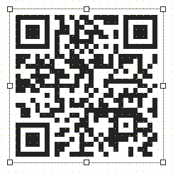
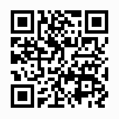
Widget QRViewer makes it possible to convert a website address (URL) into a QR code®. By scanning the code, the user can access the website without having to tediously enter the address (URL) manually.
The following properties cannot be used in compound widget "Mapping":
zIndex, left, top, height, width
Appearance
|
|
Editor |
Web browser |
Properties
Type |
Description |
Bindable |
Necessary |
Default value |
|
Defines the usability of the widget. A disabled widget (enable=false) does not react to user interaction and does not trigger events. The "enable" behavior is inherited from the container widgets to the child widgets. |
|
|
true |
||
permissionOperate |
Defines the roles that are permitted to use the widget. For roles without sufficient rights, the widget does not react to user interaction and does not trigger events. |
|
|
|
|
permissionView |
Defines the roles that are permitted to see the widget. For roles without sufficient rights, the widget is hidden. |
|
|
|
|
errorCorrectionLevel |
Defines the error correction level of the QR code®. Depending on the operating environment, it is possible to choose between four levels that allow reconstruction of 7-30% of the damaged file. The higher the level, the more data in the QR code. For additional information, see "Data type". |
|
|
medium |
|
A complete URL of the web page must be entered here. Important: The protocol to be used should always be specified (http:// or https://). The QR reader recognizes the protocol prefix (http(s)://) and interprets the text as a website address (URL). |
|
|
|
||
Reference to a customizable widget style. |
|
|
default |
||
Defines the visibility of the widget. The widget can be hidden with visible=false. (visible = true, hidden = false). The "visible" behavior is inherited from the container widget to the child widgets. |
|
|
true |
||
zIndex determines the z-order of the widget. With overlapping widgets, the zIndex determines which widget is on the top and which one is on the bottom. The widget with the larger zIndex is on top, and the one with the smaller zIndex is on the bottom. The zIndex must be unique within a piece of content or a container widget. The zIndex is automatically assigned by the visual editor and can therefore be changed via the toolbar. |
|
|
|
||
left |
Absolute position measured from the left border of the surrounded element (e.g. container widget or content). |
|
|
|
|
top |
Absolute position measured from the top border of the surrounded element (e.g. container widget or content). |
|
|
|
|
height |
Defines the total height of the widget in pixels. A value in % refers to the height of the surrounding element. |
|
|
100 |
|
width |
Defines the total width of the widget in pixels. A value in % refers to the width of the surrounding element. |
|
|
100 |
|
tooltip |
Defines the text that should appear as information when the tooltip indicator is pressed. You can use a static text or a text from the text system. For more information, see here. Mode "Tooltip" must be enabled for this. There are two different options for this: •Using action "ShowTooltip" •Using action "Client system" ShowTooltips. |
|
|
|
|
tabIndex |
Property tabIndex is used to manage the tab order during keyboard operation. For additional information, see Keyboard operation. ENTER triggers event Click if tabIndex ≥0. |
|
|
-1 |
Styleable properties
Type |
Description |
Default value |
|
backColor |
Defines the background color of the widget. |
#ffffff |
|
borderColor |
Defines the color of the border around the widget. |
#333333 |
|
borderStyle |
Defines the style of the border around the widget. Borders can be unbroken, dashed or dotted. |
none |
|
borderWidth |
Defines the width of the border around the widget. |
2px |
|
color |
Defines the color of the code. |
#000000 |
|
opacity |
Defines the transparency of the widget. The lower the value, the more transparent the widget. |
1 |
|
rotation |
Defines the rotation of the widget, e.g. a value of 90 degrees changes the rotation of the widget by 90 degrees clockwise. |
0deg |
|
margin |
Defines the offset of the external boundary of the widget to the widget's actual set position. For more information, see here. |
0px |
|
shadow |
Defines the shadow of the widget. |
none |

