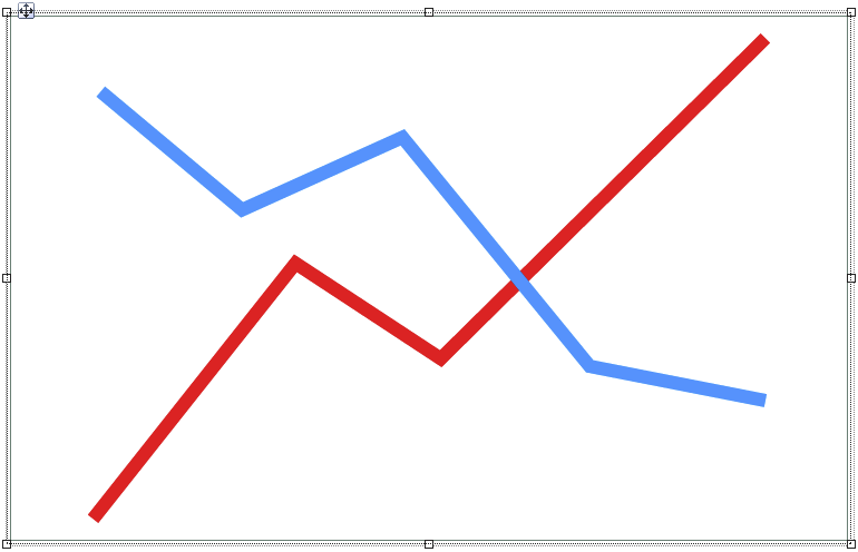
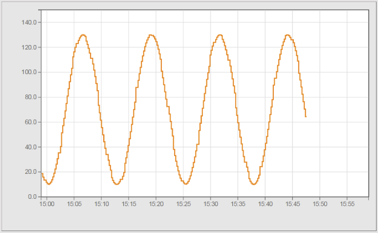
Widget "OnlineChart" is a container for displaying current process values in a graph.
For more information about container or child widgets, see Definition of container/child widgets.
|
Several tutorials about this topic can be found on our YouTube channel. |
|
For this widget, there is a use case that explains how the widget can be used. |
|
Our B&R Tutorial Portal includes a tutorial on widget OnlineChart (GER/ENG). (access data) |
The following properties cannot be used in compound widget "Mapping":
zIndex, left, top, height, width
Appearance
|
|
Editor |
Web browser |
Properties
Type |
Description |
Bindable |
Necessary |
Default value |
|
autoscale |
Defines whether the minimum and maximum y-axis is automatically adjusted to the values displayed on the graph. Minimum/Maximum values defined by the user are ignored if "autoscale" = true. |
|
|
false |
|
chartMargin |
Defines the spacing between the area where the graph is displayed and the outer border of the widget. |
|
|
15px |
|
Defines the usability of the widget. A disabled widget (enable=false) does not react to user interaction and does not trigger events. The "disabled..." style is displayed at runtime. The "enable" behavior is inherited from the container widgets to the child widgets. |
|
|
true |
||
permissionOperate |
Defines the roles that are permitted to use the widget. For roles without sufficient rights, the widget does not react to user interaction and does not trigger events. |
|
|
|
|
permissionView |
Defines the roles that are permitted to see the widget. For roles without sufficient rights, the widget is hidden. |
|
|
|
|
showGrid |
Defines if the grid lines are shown. |
|
|
true |
|
Reference to a customizable widget style. |
|
|
default |
||
Defines the visibility of the widget. The widget can be hidden with visible=false. (visible = true, hidden = false). The "visible" behavior is inherited from the container widget to the child widgets. |
|
|
true |
||
zIndex determines the z-order of the widget. With overlapping widgets, the zIndex determines which widget is on the top and which one is on the bottom. The widget with the larger zIndex is on top, and the one with the smaller zIndex is on the bottom. The zIndex must be unique within a piece of content or a container widget. The zIndex is automatically assigned by the visual editor and can therefore be changed via the toolbar. |
|
|
|
||
left |
Absolute position measured from the left border of the surrounded element (e.g. container widget or content). |
|
|
|
|
top |
Absolute position measured from the top border of the surrounded element (e.g. container widget or content). |
|
|
|
|
height |
Defines the total height of the widget in pixels. A value in % refers to the height of the surrounding element. |
|
|
440 |
|
width |
Defines the total width of the widget in pixels. A value in % refers to the width of the surrounding element. |
|
|
720 |
|
tooltip |
Defines the text that should appear as information when the tooltip indicator is pressed. A static text or a text from the text system can be used. For more information, see here. Mode "Tooltip" must be enabled for this. There are two different options for this: •Using action "ShowTooltip" •Using action "Client system" ShowTooltips. |
|
|
|
|
tabIndex |
Property tabIndex is used to manage the tab order during keyboard operation. For additional information, see Keyboard operation. ENTER triggers event Click if tabIndex ≥0. |
|
|
-1 |
Styleable properties
Type |
Description |
Default value |
|
backColor |
Defines the background color of the widget. |
Transparent |
|
disabledBackColor |
Defines the background color of the widget in the disabled state. |
Transparent |
|
backGroundGradient |
Defines the background color of the widget as a color gradient. |
|
|
disabledBackGroundGradient |
Defines the background color of the widget as a color gradient in the disabled state. |
|
|
chartColor |
Defines the background color of the graph. |
#FFFFFF |
|
disabledChartColor |
Defines the background color of the graph in the disabled state. |
#FFFFFF |
|
chartBorderColor |
Defines the color of the border around the graphs. |
#000000 |
|
disabledChartBorderColor |
Defines the color of the border around the graphs in the disabled state. |
#999999 |
|
gridColor |
Defines the line color for the grid. |
#DDDDDD |
|
disabledGridColor |
Defines the line color of the grid in the disabled state. |
#EEEEEE |
|
fontSize |
Defines the size of the font used to display the text. |
12px |
|
fontName |
Defines the font used for the text shown. |
Arial |
|
borderWidth |
Defines the width of the border around the widget. |
1px |
|
borderColor |
Defines the color of the border around the widget. |
#5B7C70 |
|
disabledBorderColor |
|
#C8C8C8 |
|
borderStyle |
Defines the style of the border around the widget. Borders can be unbroken, dashed or dotted. |
solid |

