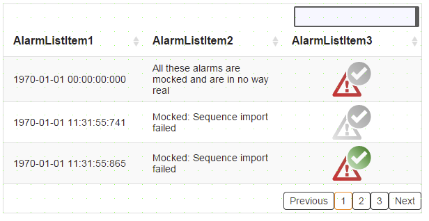
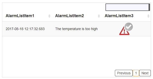
Widget "AlarmList" provides the necessary interface for listing and interacting with system alarms. These system alarms are made available by mapp component MpAlarmX.
To use this widget, library MpServer must be present on the target system. "MpServer" is used for internal communication. For more information, see here.
There is an optimized version of this widget. It allows this widget to run on devices with less performance (T50, for example). For information about how this optimization can be set, see the concept page. Optimization.
|
For this widget, there are various use cases that explain how the widget can be used. |
|
Our B&R Tutorial Portal includes a tutorial on widget AlarmList (GER/ENG). (access data) |
The following properties cannot be used in compound widget "Mapping":
zIndex, left, top, height, width
Appearance
|
|
Editor |
Web browser |
Properties
Type |
Description |
Bindable |
Necessary |
Default value |
|
imagePrefix |
Relative path to images displayed on the widget for the category. For more information, see here. |
|
|
|
|
imageSuffix |
Defines the file extension of the images located in the path of property imagePrefix. |
|
|
.png |
|
imageActive |
Relative path to an image that is displayed on the widget for state "Active and unacknowledged". |
|
|
|
|
imageActiveAcknowledged |
Relative path to an image that is displayed on the widget for state "Active and acknowledged". |
|
|
|
|
imageInactive |
Relative path to an image that is displayed on the widget for state "Inactive and unacknowledged". |
|
|
|
|
nextText |
Text display in the button for switching to the next page. Only applies if "paging" = true. |
|
|
Next |
|
previousText |
Text display in the button for switching to the previous page. Only applies if "paging" = true. |
|
|
Previous |
|
paging |
Divides alarms across multiple pages. The appearance of the buttons used for this can be modified within a theme using a ToggleButton style called "default". |
|
|
true |
|
showPagingButtons |
Defines whether the integrated page change system is used. If true, the predefined navigation is displayed; if false then the external buttons are used via the event/action system. The events related to the page change are only triggered if property showPagingButtons=false. |
|
|
true |
|
itemsPerPage |
Defines the number of alarms displayed on each page. Only applies if "paging" = true. |
|
|
3 |
|
searchBox |
Text field for searching for alarms in the list. |
|
|
true |
|
Connection to the mapp component. The important thing here is that the binding mode is "Read/Write". For more information, see .Concept |
|
|
|
||
Defines the usability of the widget. A disabled widget (enable=false) does not react to user interaction and does not trigger events. The "enable" behavior is inherited from the container widgets to the child widgets. |
|
|
true |
||
left |
Absolute position measured from the left border of the surrounded element (e.g. container widget or content). |
|
|
|
|
top |
Absolute position measured from the top border of the surrounded element (e.g. container widget or content). |
|
|
|
|
permissionOperate |
Defines the roles that are permitted to use the widget. For roles without sufficient rights, the widget does not react to user interaction and does not trigger events. |
|
|
|
|
permissionView |
Defines the roles that are permitted to see the widget. For roles without sufficient rights, the widget is hidden. |
|
|
|
|
Reference to a customizable widget style. |
|
|
default |
||
Defines the visibility of the widget. The widget can be hidden with visible=false. (visible = true, hidden = false). The "visible" behavior is inherited from the container widget to the child widgets. |
|
|
true |
||
width |
Defines the total width of the widget in pixels. A value in % refers to the width of the surrounding element. |
|
|
600 |
|
height |
Defines the total height of the widget in pixels. A value in % refers to the height of the surrounding element. |
|
|
300 |
|
zIndex determines the z-order of the widget. With overlapping widgets, the zIndex determines which widget is on the top and which one is on the bottom. The widget with the larger zIndex is on top, and the one with the smaller zIndex is on the bottom. The zIndex must be unique within a piece of content or a container widget. The zIndex is automatically assigned by the visual editor and can therefore be changed via the toolbar. |
|
|
|
||
Defines the format used to display the date and/or time. It is possible to specify a format string (e.g. "HH:mm:ss") or predefined pattern (e.g. "F"). |
|
|
F |
||
Defines the filter settings. Can only be modified using the configuration dialog box. A variable that receives the correct settings from the configuration dialog box must be bound. For more information, see here. |
|
|
|
||
Defines the sorting settings. Can only be modified using the configuration dialog box. A variable that receives the correct settings from the configuration dialog box must be bound. For more information, see here. |
|
|
|
||
Defines the style settings. Can only be modified using the configuration dialog box. A variable that receives the correct settings from the configuration dialog box must be bound. For more information, see here. |
|
|
|
||
headerHeight |
Defines the total height of the header. |
|
|
40 |
|
tooltip |
Defines the text that should appear as information when the tooltip indicator is pressed. A static text or a text from the text system can be used. For more information, see here. Mode "Tooltip" must be enabled for this. There are two different options for this: •Using action "ShowTooltip" •Using action "Client system" ShowTooltips. |
|
|
|
|
rowHeight |
Defines the row height. This property can overwrite property "rowHeight" of widget "Table" if the value is not equal to 0. This is only possible, however, if widget "TableItem" has been defined as a line. For more information, see concept page rowHeight. |
|
|
0 |
|
busyIndicatorDelay |
Defines the time (ms) until indicator "Busy" is displayed. It is displayed immediately at 0. At 1000, the indicator is only displayed after 1000 ms if it should still be displayed. If the number is negative, indicator "Busy" is not displayed. |
|
|
0 |
|
tabIndex |
Property tabIndex is used to manage the tab order during keyboard operation. For additional information, see Keyboard operation. If widget AlarmList has the focus, the TAB and Shift+TAB keys can be used to navigate between the search field, header, list and page buttons. Allows alarms to be selected with the cursor keys or scrolling through the list with PageUp and PageDown. ENTER triggers event Click when tabIndex ≥0 and selects the focused alarm. |
|
|
-1 |
Styleable properties
Type |
Description |
Default value |
|
headerBackColor |
Defines the background color of the header. |
#FFFFFF |
|
headerTextColor |
Defines the color used to display the text in the header. |
#000000 |
|
headerFontSize |
Defines the size of the font used to display the text in the header. |
16px |
|
backColorEvenRow |
Defines the background color of an even-numbered row. |
#FFFFFF |
|
backColorOddRow |
Defines the background color of an odd-numbered row. |
#F9F9F9 |
|
backColorSelectedRow |
Defines the background color of a selected row. |
#FF8800 |
|
textColorSelectedRow |
Defines the color used to display the text in a selected row. |
#FFFFFF |
|
backColor |
Defines the background color of the widget. |
Transparent |
|
borderStyle |
Defines the style of the border around the widget. Borders can be unbroken, dashed or dotted. |
none |
|
borderWidth |
Defines the width of the border around the widget. |
1px |
|
borderColor |
Defines the color of the border around the widget. |
#DDDDDD |
|
textColor |
Defines the color used to display the text. |
#000000 |
|
fontName |
Defines the font used for the text shown. |
Arial |
|
fontSize |
Defines the size of the font used to display the text. |
14px |
|
shadow |
Defines the shadow of the widget. |
none |
|
cornerRadius |
Defines the corner style of the widget. |
0px |
|
backGroundGradient |
Defines the background color of the widget as a color gradient. |
|
|
sortingButtonColor |
Defines the color used to display the icons for sorting when not applied. |
#ECECEC |
|
sortingButtonActiveColor |
Defines the color used to display the icon for sorting when applied. |
#5F8DD3 |
|
headerBackGroundGradient |
Defines the background color of the header as a color gradient. |
|
|
headerBold |
Defines whether text in the header is shown in bold. |
true |
|
headerItalic |
Defines whether text in the header is shown in italics. |
false |
|
headerTextAlign |
Defines the orientation of the text in the header. |
left |
|
headerCellBorderWidth |
Defines the width of the header's border. |
1px |
|
headerCellBorderStyle |
Defines the style of the header's border. |
none |
|
headerCellBorderColor |
Defines the color of the header's border. |
#DDDDDD |
|
headerCellPadding |
Defines the spacing between the outer boundaries of the header cells and their contents. |
0px 8px |
|
bold |
Defines whether the text is shown in bold. |
false |
|
italic |
Defines whether the text is shown in italics. |
false |
|
textAlign |
Defines the orientation of the text. |
left |
|
cellBorderWidth |
Defines the width of the cells' border. |
1px 0px 0px 0px |
|
cellBorderColor |
Defines the color of the cells' border. |
#DDDDDD |
|
cellBorderStyle |
Defines the style of the border around the cells. |
solid |
|
cellPadding |
Defines the spacing between the outer boundary of the table entry and its content. For more information, see here. |
8px 14px |
|
opacity |
Defines the transparency of the widget. The lower the value, the more transparent the widget. |
1 |
|
disabledBackColorEvenRow |
Defines the background color of an even row in the disabled state. |
#EAEAEA |
|
disabledBackColorOddRow |
Defines the background color of an odd row in the disabled state. |
#FFFFFF |
|
disabledHeaderBackColor |
Defines the background color of the header in the disabled state. |
#FCFCFC |
|
disabledHeaderTextColor |
Defines the color used to display the text in the header in the disabled state. |
#C8C8C8 |
|
disabledTextColor |
Defines the color of the text in the disabled state. |
#C8C8C8 |
|
mouseDownBackColor |
Defines the background color of the table row only as long as it is pressed. A selected row is not displayed in color mouseDown but in color backColor instead. If the "selected" properties are set, the mouseDown settings are not applied. |
transparent |
|
mouseDownTextColor |
Defines the text color in the table row only as long as it is pressed. A selected row is not displayed in the mouseDown color but in the backColor color instead. If the "selected" properties are set, the mouseDown settings are not applied. |
transparent |

