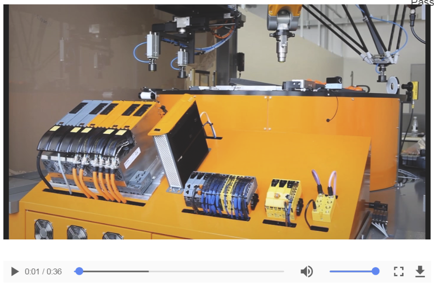
Widget "VideoPlayer" shows a video and allows the user to control playback using the video player.
The size and resolution of videos should be taken into account.
The following clients support the following video formats:
•Chromium engine: MP4, WEBM, OGG
•Linux: MP4 (H.264 codec must be installed)
•Windows: No limitations when using the Chromium engine
The following properties cannot be used in compound widget "Mapping":
zIndex, left, top, height, width
Appearance
|
|
Editor |
Web browser |
Properties
Type |
Description |
Bindable |
Necessary |
Default value |
|
autoplay |
Enables "auto-play" functionality in order to start the video as soon as the widget has finished initializing. The "autoplay" function is only supported on Android and iOS devices if property muted is set to value true. |
|
|
false |
|
controls |
Defines whether the video player allows the user to perform operations such as pause, repeat and mute. |
|
|
true |
|
Defines the usability of the widget. A disabled widget (enable=false) does not react to user interaction and does not trigger events. The "enable" behavior is inherited from the container widgets to the child widgets. |
|
|
true |
||
loop |
If this function is enabled, the video player restarts the video from the beginning once it has reached the end. |
|
|
false |
|
muted |
Mutes the video. |
|
|
false |
|
permissionOperate |
Defines the roles that are permitted to use the widget. For roles without sufficient rights, the widget does not react to user interaction and does not trigger events. |
|
|
|
|
permissionView |
Defines the roles that are permitted to see the widget. For roles without sufficient rights, the widget is hidden. |
|
|
|
|
poster |
Defines an image to be displayed while the video is loaded. |
|
|
|
|
preload |
Defines whether the video should be preloaded. Possible values: 'none', 'auto', 'metadata'. none: The video is not preloaded. auto: The video is preloaded. metadata: The video's metadata is preloaded. |
|
|
none |
|
Path to a video file that has been added in Automation Studio (e.g. Media/Video.mp4). Supported formats: MP4, WEBM and OGG. Note: iOS devices can only play MP4 files with H.264 encoding. Allows the use of a text key. |
|
|
|
||
Reference to a customizable widget style. |
|
|
default |
||
Defines the visibility of the widget. The widget can be hidden with visible=false. (visible = true, hidden = false). The "visible" behavior is inherited from the container widget to the child widgets. |
|
|
true |
||
zIndex determines the z-order of the widget. With overlapping widgets, the zIndex determines which widget is on the top and which one is on the bottom. The widget with the larger zIndex is on top, and the one with the smaller zIndex is on the bottom. The zIndex must be unique within a piece of content or a container widget. The zIndex is automatically assigned by the visual editor and can therefore be changed via the toolbar. |
|
|
|
||
left |
Absolute position measured from the left border of the surrounded element (e.g. container widget or content). |
|
|
|
|
top |
Absolute position measured from the top border of the surrounded element (e.g. container widget or content). |
|
|
|
|
height |
Defines the total height of the widget in pixels. A value in % refers to the height of the surrounding element. |
|
|
480 |
|
width |
Defines the total width of the widget in pixels. A value in % refers to the width of the surrounding element. |
|
|
640 |
|
tooltip |
Defines the text that should appear as information when the tooltip indicator is pressed. You can use a static text or a text from the text system. For more information, see here. Mode "Tooltip" must be enabled for this. There are two different options for this: •Using action "ShowTooltip" •Using action "Client system" ShowTooltips. |
|
|
|
|
tabIndex |
Property tabIndex is used to manage the tab order during keyboard operation. For additional information, see Keyboard operation. ENTER triggers event Click if tabIndex ≥0. It is not possible to operate widget VideoPlayer with the keyboard. |
|
|
-1 |
Styleable properties
Type |
Description |
Default value |
|
backColor |
Defines the background color of the widget. |
Transparent |
|
backGroundGradient |
Defines the background color of the widget as a color gradient. |
|
|
borderWidth |
Defines the width of the border around the widget. |
2px |
|
borderColor |
Defines the color of the border around the widget. |
#FFF |
|
borderStyle |
Defines the style of the border around the widget. Borders can be unbroken, dashed or dotted. |
none |
|
cornerRadius |
Defines the corner style of the widget. |
0px |
|
shadow |
Defines the shadow of the widget. |
none |
|
margin |
Defines the offset of the external boundary of the widget to the widget's actual set position. For more information, see here. |
0px |
|
opacity |
Defines the transparency of the widget. The lower the value, the more transparent the widget. |
1 |
|
rotation |
Defines the rotation of the widget, e.g. a value of 90 degrees changes the rotation of the widget by 90 degrees clockwise. |
0deg |

