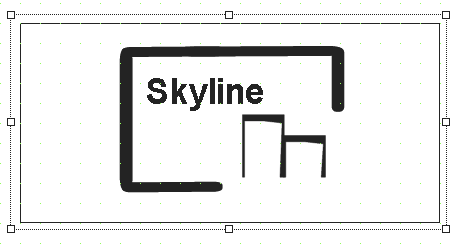
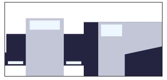
Widget "Skyline" visually displays a machine line. The machine line is defined in mapp Skyline.
For an explanation of the terms and definitions used for widget "Skyline", see section Basic concept of mapp Skyline. For diagnostic information about mapp Skyline and widget "Skyline" editor, see here.
To use this widget, library MpServer must be present on the target system. "MpServer" is used for internal communication. For more information, see here.
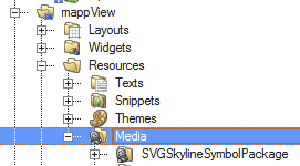
The "SVG Skyline" library provided by mapp View contains images that can be used for the skyline. This library is available via the toolbox and can be stored in the mapp View package in the Logical View under Resources → Media.
The following properties cannot be used in compound widget "Mapping":
zIndex, left, top, height, width
Appearance
|
|
Editor |
Web browser |
Properties
Type |
Description |
Bindable |
Necessary |
Default value |
|
Connection to the mapp component. The important thing here is that the binding mode is "Read/Write". |
|
|
|
||
Defines the usability of the widget. A disabled widget (enable=false) does not react to user interaction and does not trigger events. The "enable" behavior is inherited from the container widgets to the child widgets. |
|
|
true |
||
Defines the visibility of the widget. The widget can be hidden with visible=false. (visible = true, hidden = false). The "visible" behavior is inherited from the container widget to the child widgets. |
|
|
true |
||
Reference to a customizable widget style. |
|
|
default |
||
permissionView |
Defines the roles that are permitted to see the widget. For roles without sufficient rights, the widget is hidden. |
|
|
|
|
permissionOperate |
Defines the roles that are permitted to use the widget. For roles without sufficient rights, the widget does not react to user interaction and does not trigger events. |
|
|
|
|
zIndex determines the z-order of the widget. With overlapping widgets, the zIndex determines which widget is on the top and which one is on the bottom. The widget with the larger zIndex is on top, and the one with the smaller zIndex is on the bottom. The zIndex must be unique within a piece of content or a container widget. The zIndex is automatically assigned by the visual editor and can therefore be changed via the toolbar. |
|
|
|
||
left |
Absolute position measured from the left border of the surrounded element (e.g. container widget or content). |
|
|
|
|
top |
Absolute position measured from the top border of the surrounded element (e.g. container widget or content). |
|
|
|
|
width |
Defines the total width of the widget in pixels. A value in % refers to the width of the surrounding element. |
|
|
800 |
|
height |
Defines the total height of the widget in pixels. A value in % refers to the height of the surrounding element. |
|
|
200 |
|
tooltip |
Defines the text that should appear as information when the tooltip indicator is pressed. You can use a static text or a text from the text system. For more information, see here. Mode "Tooltip" must be enabled for this. There are two different options for this: Use action "ShowTooltip" or client system action ShowTooltips. |
|
|
|
|
Defines whether identical modules should be grouped together or not. |
|
|
false |
||
showGroupedModules |
Defines whether the widget is used to display grouped modules or the entire configuration. For more information, see Show extended group view. If this property is set to true, grouped module data is displayed instead of a configuration received via mpLink. |
|
|
false |
|
Defines whether the options should be displayed or not. |
|
|
false |
||
minXS |
Defines the minimum size for a size XS module type. |
|
|
30px |
|
maxXS |
Defines the maximum size for a size XS module type. |
|
|
50px |
|
minS |
Defines the minimum size for a size S module type. |
|
|
80px |
|
maxS |
Defines the maximum size for a size S module type |
|
|
100px |
|
minM |
Defines the minimum size for a size M module type. |
|
|
130px |
|
maxM |
Defines the maximum size for a size M module type. |
|
|
150px |
|
minL |
Defines the minimum size for a size L module type. |
|
|
180px |
|
maxL |
Defines the maximum size for a size L module type |
|
|
200px |
|
Displays the index of a selected module. |
|
|
-1 |
||
Displays the module name of a selected module. |
|
|
|
||
Displays the module types of the selected module. |
|
|
|
||
Displays the index of the selected module types. |
|
|
-1 |
||
Defines a string that contains the data for a selected group. This property is used in conjunction with showGroupedModules. |
|
|
|
||
Relative path to images that is used for the skyline. |
|
|
|
||
pointerImage |
Defines the image that is displayed when a module is selected. |
|
|
|
|
moduleSymbolHeight |
Defines the height of the module symbol. |
|
|
0 |
|
moduleSymbolWidth |
Defines the width of the module symbol. |
|
|
0 |
|
moduleSymbolOffsetX |
Defines the x-position of the module symbol within the module. |
|
|
0 |
|
moduleSymbolOffsetY |
Defines the y-position of the module symbol in the module. |
|
|
0 |
|
moduleTextOffsetX |
Defines the x-position of the module text within the module. |
|
|
0 |
|
moduleTextOffsetY |
Defines the y-position of the module text in the module. |
|
|
0 |
|
notificationHeight |
Defines the height of the notification symbol. |
|
|
0 |
|
notificationWidth |
Defines the width of the notification symbol. |
|
|
0 |
|
notificationOffsetX |
Defines the x-position of the notification symbol in the module. |
|
|
0 |
|
notificationOffsetY |
Defines the y-position of the notification symbol in the module. |
|
|
0 |
|
moduleOptionHeight |
Defines the height of the option symbol. |
|
|
0 |
|
moduleOptionWidth |
Defines the width of the option symbol. |
|
|
0 |
|
moduleOptionOffsetX |
Defines the x-position of the option symbol in the module. |
|
|
0 |
|
moduleOptionOffsetY |
Defines the y-position of the option symbol in the module. |
|
|
0 |
|
moduleMargin |
Defines the offset of the external boundary of a module to the actual set position of the next module. |
|
|
0px |
|
tabIndex |
Property tabIndex is used to manage the tab order during keyboard operation. For additional information, see Keyboard operation. ENTER triggers event Click if tabIndex ≥0. It is not possible to operate widget Skyline with the keyboard. |
|
|
-1 |
Styleable properties
Type |
Description |
Default value |
|
backColor |
Defines the background color of the widget. |
#FFFFFF |
|
backGroundGradient |
Defines the background color of the widget as a color gradient. |
|
|
borderColor |
Defines the color of the border around the widget. |
#000000 |
|
borderStyle |
Defines the style of the border around the widget. Borders can be unbroken, dashed or dotted. |
solid |
|
borderWidth |
Defines the width of the border around the widget. |
1px |
|
textColor |
Defines the color used to display the text. |
#000000 |
|
fontName |
Defines the font used for the text shown. |
Arial |
|
fontSize |
Defines the size of the font used to display the text. |
14px |
|
shadow |
Defines the shadow of the widget. |
none |
|
disabledBackColor |
Defines the background color of the widget in the disabled state. |
#D3D3D3 |
|
disabledBackGroundGradient |
Defines the background color of the widget as a color gradient in the disabled state. |
|
|
disabledBorderColor |
Defines the color of the border around the widget in the disabled state. |
#000000 |
|
disabledBorderStyle |
Defines the style of the border in the disabled state. |
solid |
|
disabledBorderWidth |
Defines the width of the border around the widget in the disabled state. |
1px |
|
disabledTextColor |
Defines the color of the text in the disabled state. |
#000000 |
|
opacity |
Defines the transparency of the widget. The lower the value, the more transparent the widget. |
1 |
|
moduleOptionMargin |
Defines the offset of the external boundary of a module option to the actual set position of the next module option. |
0px |
|
badgeBackColor |
Defines the background color of the notification symbol. |
#F5F5DC |
|
badgeTextColor |
Defines the text color of the notification symbol. |
#000000 |
|
badgeFontName |
Defines the font color of the notification symbol. |
Arial |
|
badgeFontSize |
Defines the font size of the notification symbol. |
14px |
|
badgeShadow |
Defines the shadow of the notification symbol. |
none |


