This section explains how to integrate widget "Skyline".
For an explanation of the terms and definitions used for widget "Skyline", see section Basic concept of mapp Skyline. For diagnostic information about mapp Skyline and widget "Skyline" editor, see here.
Selecting a module
It is possible to display an image as soon as a module has been selected. This way, the user knows which module was just selected. The image, which can be an arrow, for example, is defined by property pointerImage.
The image is always displayed at the top of widget "Skyline", directly above the selected module. This could look like this:
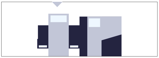
Fig.: Selected module
Display notifications
In the MpSkyline configuration, in section "Notification collection", various notifications can be created. Function MpSkylineSetNotification or MpSkylineResetNotification is used to enable or disable a notification for a module.
If a notification has been enabled, a symbol can be displayed on the module. For this, an image with the same name as the notification in the MpSkyline configurationmust exist in the path specified with imagePrefix.
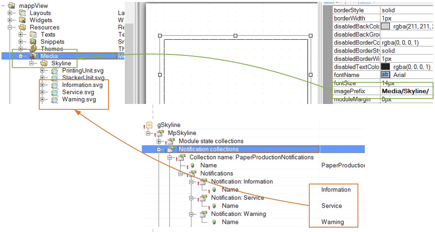
If a notification has been enabled, it can look like this on widget "Skyline":
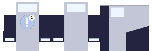
For information about how the symbol is positioned in the module, see section Positioning texts and symbols.
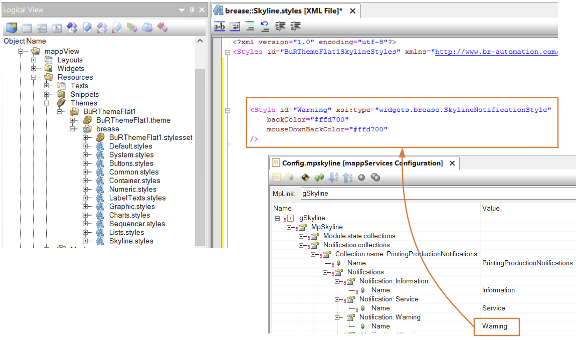
The appearance of the notification symbol can be customized by the SkylineNotificationStyle. To do this, the style ID must have the same name as the notification:
Display module state
In the MpSkyline configuration, in section "State collection", various states can be created. Function MpSkylineSetModuleState is used to enable a state for a module.
The module can be displayed in various ways, depending on which state is active. A style must be created for this. For an explanation of the style properties to be used, see here. The style ID must be identical to the name of the state: The name of the state is defined in the MpSkyline configuration.
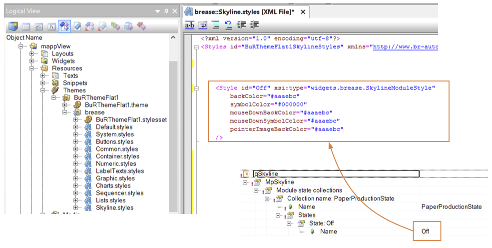
Depending on which state the module is in, the style with the same ID is applied accordingly. This looks something like this in Widget "Skyline":

Fig.: Module is in state "Error"
Display module symbol
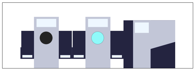
To better identify modules in the skyline, module symbols can be used.
For this, an image with the same name as the module in the MpSkyline configurationmust exist in specified path imagePrefix. If there is no image for the module, no module symbol is displayed.

This way, the individual modules can be identified more easily.
Display option
To display options in the module, they must first be configured in the MpSkyline configuration. Property showModuleOption must also equal true.
If a state has been enabled for an option, a symbol can be displayed on the module. For this, an image with the same name as the Options state in the MpSkyline configuration must exist in the path specified with imagePrefix. Action "SetShowModuleOption" can also be used to switch the visibility of options on or off.
Options cannot be selected if a notification is active. Notifications can be used to display errors or warnings, so they must be addressed before the options are changed.


Positioning/Grouping the modules
All modules are displayed in the center of widget "Skyline". The height of the modules is automatically adjusted to the height of widget "Skyline". The width of the modules is defined by properties minXS, maxXS, minS, maxS, minM, maxM, minL and maxL. Depending on how wide widget "Skyline" is configured, the width of the modules is set between the minimum and maximum defined limits. The widget scales the modules so that all modules within the widget can be displayed. If it is not possible to place all modules inside the widget even though the minimum width was already used, there are two options:
Grouping modules
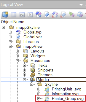
To ensure a better view in a skyline, the group function can be used. Modules that are arranged one after the other and that are of the same type, are grouped. The grouping function is defined in the MpSkyline configuration under "Machine skyline". Property groupModules must also equal true. The important thing here is that a grouping image is available. This image is used instead of the module type images. The grouping image must be saved under the name "ModuleType_group.svg". This means that for module type "Printer", the grouping image must be "Printer_group.svg"!
Scrollbar
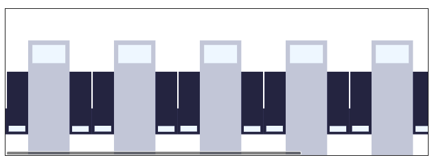
If the grouping function is not desired or not possible because different module types are always being used, a scrollbar is displayed so that the skyline can be displayed in the widget. It could look something like this:
Displaying the extended group view
A possibility exists to clearly display the grouped modules in an extra view. This requires a second Skyline widget. The next section provides a step-by-step explanation of how the second Skyline widget must to be configured:
Step 1:
A second Skyline widget will be inserted on the piece of content where the first one is already located. The second Skyline can, for example, be placed under or over the first Skyline.
Step 2:
Property showGroupedModules of the newly added Skyline widget is set to true. This defines that the widget is used to display the grouped modules.
Step 3:
The same mapp Link as with the first Skyline widget is attached to the mpLink property. The reason for this is that the second Skyline widget needs exactly the same information (modules, groups, etc.) as the first one. In general, all properties like pointerImage, imagePrefix, etc. should be exactly the same so that the second Skyline widget can display the modules as desired.
Step 4:
Next the two Skyline widgets must be connected to each other via property selectedGroupData. The second Skyline widget connects selectedGroupData to selectGroupData from the first Skyline widget.
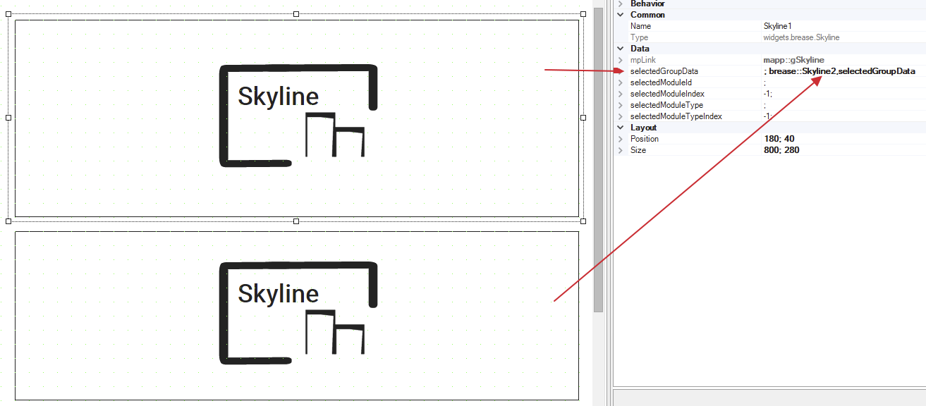
Results:
If a grouped module is selected in the original Skyline widget, then the second Skyline widget shows an exact view of the grouping. For this, it is necessary to click on the grouped module.
The created group view will look like this when connected to the HMI application:
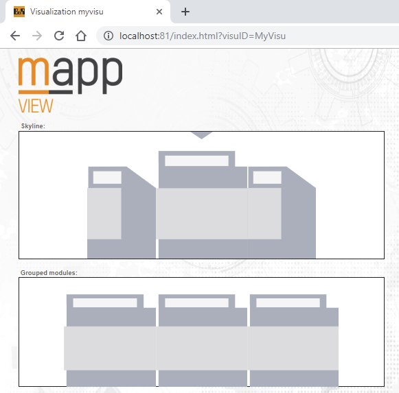
If you click on a module that does not contain grouped modules, the second Skyline widget does not display any modules.
The Skyline widget, where property showGroupedModules is set to true, displays the data received from property selectedGroupData instead of data received from the mapp Link binding.