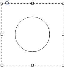
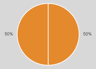
Widget "PieChart" provides a graph for displaying numerical values. Widget "PieChartItem" is needed here; its values are displayed as sections on widget "PieChart".
The following properties cannot be used in compound widget "Mapping":
zIndex, left, top, height, width
Appearance
The image on the right shows a "PieChart" widget with two "PieChartItem" widgets in a web browser.
|
|
Editor |
Web browser |
Properties
Type |
Description |
Bindable |
Necessary |
Default value |
|
transitionTime |
Defines the time (ms) used by the child elements to visually transition from an old value to a new value. |
|
|
0 |
|
Defines the unit code of the widget. |
|
|
|
||
showData |
Defines whether a value, calculated percentage or no value should be shown for each area. |
|
|
percentage |
|
Determines the number format of the percentage per unit. |
|
|
{'metric':{ 'decimalPlaces' : 0, 'minimumIntegerDigits' : 1 }, 'imperial' :{ 'decimalPlaces' : 0, 'minimumIntegerDigits' : 1 }, 'imperial-us' :{ 'decimalPlaces' : 0, 'minimumIntegerDigits' : 1 }} |
||
showUnit |
Defines whether the unit symbol for the selected unit should be displayed in the information box. |
|
|
false |
|
infoBox |
Defines whether a box with additional information is shown when clicking on an area. |
|
|
true |
|
Defines the number format for the widget. This number format is used within the information box. |
|
|
{'metric':{ 'decimalPlaces' : 2, 'minimumIntegerDigits' : 1 }, 'imperial' :{ 'decimalPlaces' : 2, 'minimumIntegerDigits' : 1 }, 'imperial-us' :{ 'decimalPlaces' : 2, 'minimumIntegerDigits' : 1 }} |
||
itemPadding |
Defines the spacing between two sections of the circle ("PieChartItem" widgets). |
|
|
2 |
|
Defines the usability of the widget. A disabled widget (enable=false) does not react to user interaction and does not trigger events. The "enable" behavior is inherited from the container widgets to the child widgets. |
|
|
true |
||
left |
Absolute position measured from the left border of the surrounded element (e.g. container widget or content). |
|
|
|
|
top |
Absolute position measured from the top border of the surrounded element (e.g. container widget or content). |
|
|
|
|
permissionOperate |
Defines the roles that are permitted to use the widget. For roles without sufficient rights, the widget does not react to user interaction and does not trigger events. |
|
|
|
|
permissionView |
Defines the roles that are permitted to see the widget. For roles without sufficient rights, the widget is hidden. |
|
|
|
|
Reference to a customizable widget style. |
|
|
default |
||
Defines the visibility of the widget. The widget can be hidden with visible=false. (visible = true, hidden = false). The "visible" behavior is inherited from the container widget to the child widgets. |
|
|
true |
||
width |
Defines the total width of the widget in pixels. A value in % refers to the width of the surrounding element. |
|
|
200 |
|
height |
Defines the total height of the widget in pixels. A value in % refers to the height of the surrounding element. |
|
|
200 |
|
zIndex determines the z-order of the widget. With overlapping widgets, the zIndex determines which widget is on the top and which one is on the bottom. The widget with the larger zIndex is on top, and the one with the smaller zIndex is on the bottom. The zIndex must be unique within a piece of content or a container widget. The zIndex is automatically assigned by the visual editor and can therefore be changed via the toolbar. |
|
|
|
||
tooltip |
Defines the text that should appear as information when the tooltip indicator is pressed. A static text or a text from the text system can be used. For more information, see here. Mode "Tooltip" must be enabled for this. There are two different options for this: •Using action "ShowTooltip" •Using action "Client system" ShowTooltips. |
|
|
|
|
tabIndex |
Property tabIndex is used to manage the tab order during keyboard operation. For additional information, see Keyboard operation. ENTER triggers event Click if tabIndex ≥0. |
|
|
-1 |
Styleable properties
Type |
Description |
Default value |
|
backColor |
Defines the background color of the widget. |
#FFFFFF |
|
borderWidth |
Defines the width of the border around the widget. |
1px |
|
borderColor |
Defines the color of the border around the widget. |
#000000 |
|
backColorInfoBox |
Defines the background color of the infobox. |
#FFFFFF |
|
opacity |
Defines the transparency of the widget. The lower the value, the more transparent the widget. |
1 |
|
margin |
Defines the offset of the external boundary of the widget to the widget's actual set position. For more information, see here. |
0px |
|
padding |
Defines the spacing between the outer boundary of the widget and its content. For more information, see here. |
0px |
|
textColor |
Defines the color used to display the text. |
#000000 |
|
fontName |
Defines the font used for the text shown. |
Arial |
|
fontSize |
Defines the size of the font used to display the text. The font size is also applied for the infobox (property "infoBox" = true). For large font sizes (e.g. 100px), the infobox is automatically enlarged and may cover other widgets in some circumstances. |
12px |
|
bold |
Defines whether the text is shown in bold. |
false |
|
italic |
Defines whether the text is shown in italics. |
false |

