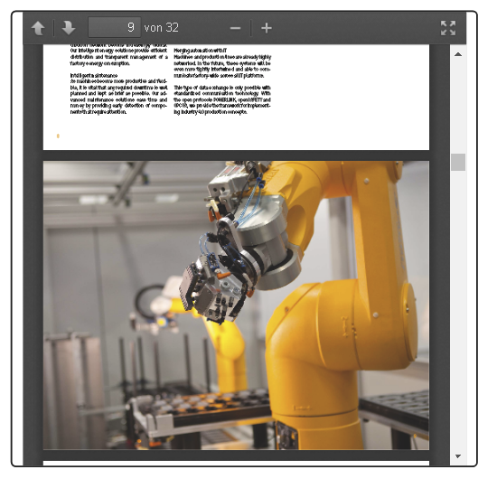
Widget "PDFViewer" makes it possible to display and work with PDF documents.
|
For this widget, there is a use case that explains how the widget can be used. |
The following properties cannot be used in compound widget "Mapping":
zIndex, left, top, height, width
Appearance
|
|
Editor |
Web browser |
Properties
Type |
Description |
Bindable |
Necessary |
Default value |
|
documentZoom |
Defines the zoom level and scroll factors for the displayed document. Values should be specified in the following format: zoom level, left, top. The zoom level is specified as a percentage (100 = 100%), while the scroll factors (optional) are coordinate offsets, where 0.0 is the upper left corner of the visible page. Possible values: auto: Automatic zoom 200: Zoom level 200%. 50, 100, 50: Zoom level 50% and the document is displayed from the range 100, 50. |
|
|
auto |
|
Defines the usability of the widget. A disabled widget (enable=false) does not react to user interaction and does not trigger events. The "enable" behavior is inherited from the container widgets to the child widgets. |
|
|
true |
||
permissionOperate |
Defines the roles that are permitted to use the widget. For roles without sufficient rights, the widget does not react to user interaction and does not trigger events. |
|
|
|
|
permissionView |
Defines the roles that are permitted to see the widget. For roles without sufficient rights, the widget is hidden. |
|
|
|
|
showToolbar |
Defines whether the PDF toolbar is displayed.
|
|
|
false |
|
namedDest |
Configures the destination within a PDF document. It is possible to specify a jump to a certain page, for example. To use this function, a target must be defined in the PDF document beforehand. For additional information, see Name destination. |
|
|
|
|
Relative path to the PDF document to be displayed. Allows the use of a text key. |
|
|
|
||
startPage |
Defines the number of the page whose contents should be initially displayed. |
|
|
0 |
|
Reference to a customizable widget style. |
|
|
default |
||
usePlugin |
Defines whether a JavaScript plug-in should be used to display the document. If false, the browser's internal PDF viewer will be used to display the document. Note: The internal PDF viewer offers better performance but limited functionality. |
|
|
true |
|
Defines the visibility of the widget. The widget can be hidden with visible=false. (visible = true, hidden = false). The "visible" behavior is inherited from the container widget to the child widgets. |
|
|
true |
||
zIndex determines the z-order of the widget. With overlapping widgets, the zIndex determines which widget is on the top and which one is on the bottom. The widget with the larger zIndex is on top, and the one with the smaller zIndex is on the bottom. The zIndex must be unique within a piece of content or a container widget. The zIndex is automatically assigned by the visual editor and can therefore be changed via the toolbar. |
|
|
|
||
left |
Absolute position measured from the left border of the surrounded element (e.g. container widget or content). |
|
|
|
|
top |
Absolute position measured from the top border of the surrounded element (e.g. container widget or content). |
|
|
|
|
height |
Defines the total height of the widget in pixels. A value in % refers to the height of the surrounding element. |
|
|
320 |
|
width |
Defines the total width of the widget in pixels. A value in % refers to the width of the surrounding element. |
|
|
240 |
|
tooltip |
Defines the text that should appear as information when the tooltip indicator is pressed. You can use a static text or a text from the text system. For more information, see here. Mode "Tooltip" must be enabled for this. There are two different options for this: •Using action "ShowTooltip" •Using action "Client system" ShowTooltips. |
|
|
|
|
tabIndex |
Property tabIndex is used to manage the tab order during keyboard operation. For additional information, see Keyboard operation. ENTER triggers event Click if tabIndex ≥0. It is not possible to operate widget PDFViewer with the keyboard. |
|
|
-1 |
Styleable properties
Type |
Description |
Default value |
|
borderWidth |
Defines the width of the border around the widget. |
0px |
|
borderColor |
Defines the color of the border around the widget. |
#FFF |
|
borderStyle |
Defines the style of the border around the widget. Borders can be unbroken, dashed or dotted. |
solid |
|
cornerRadius |
Defines the corner style of the widget. |
0px |
|
padding |
Defines the spacing between the outer boundary of the widget and its content. For more information, see here. |
0 10px |
|
margin |
Defines the offset of the external boundary of the widget to the widget's actual set position. For more information, see here. |
0px |
|
opacity |
Defines the transparency of the widget. The lower the value, the more transparent the widget. |
1 |
|
rotation |
Defines the rotation of the widget, e.g. a value of 90 degrees changes the rotation of the widget by 90 degrees clockwise. |
0deg |


