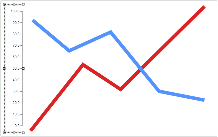
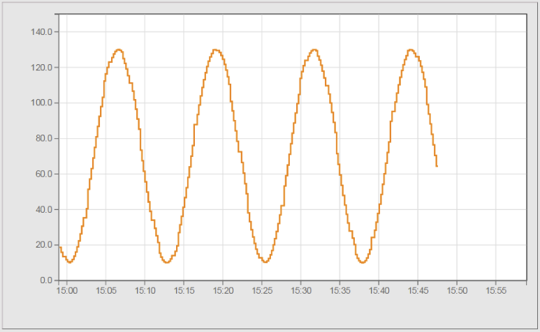
Widget "OnlineChartYAxis" defines the y-axis of the graph. This widget contains additional widgets for data binding.
The following properties cannot be used in compound widget "Mapping":
zIndex, width
Appearance
|
|
Editor |
Web browser |
Properties
Type |
Description |
Bindable |
Necessary |
Default value |
|
axisLabel |
Label for the axis. |
|
|
|
|
axisLabelDistance |
Distance between the axis and the axisLabel. |
|
|
45px |
|
axisPosition |
Position of the axis in the widget. |
|
|
left |
|
Defines the usability of the widget. A disabled widget (enable=false) does not react to user interaction and does not trigger events. The "disabled..." style is displayed at runtime. The "enable" behavior is inherited from the container widgets to the child widgets. |
|
|
true |
||
Defines the number format for the widget. |
|
|
{'metric': { 'decimalPlaces': 1, 'minimumIntegerDigits': 1 }, 'imperial': { 'decimalPlaces': 1, 'minimumIntegerDigits': 1 }, 'imperial-us': { 'decimalPlaces': 1, 'minimumIntegerDigits': 1 }} |
||
Reference to a customizable widget style. |
|
|
default |
||
Defines the unit code of the widget. |
|
|
|
||
Defines the visibility of the widget. The widget can be hidden with visible=false. (visible = true, hidden = false). The "visible" behavior is inherited from the container widget to the child widgets. |
|
|
true |
||
zIndex determines the z-order of the widget. With overlapping widgets, the zIndex determines which widget is on the top and which one is on the bottom. The widget with the larger zIndex is on top, and the one with the smaller zIndex is on the bottom. The zIndex must be unique within a piece of content or a container widget. The zIndex is automatically assigned by the visual editor and can therefore be changed via the toolbar. |
|
|
|
||
width |
Defines the total width of the widget in pixels. A value in % refers to the width of the surrounding element. |
|
|
60 |
|
tickLabelDistance |
Determines how far the tick texts should be from the axis. |
|
|
9px |
|
tickLabelRotation |
Defines the rotation of the tick texts, e.g. a value of 90 degrees changes the rotation of the widget by 90 degrees clockwise. |
|
|
0deg |
Styleable properties
type |
description |
defaultValue |
|
axisColor |
Defines the color of the axis for the widget. |
#000000 |
|
disabledAxisColor |
Defines the axis color of the widget in the disabled state. |
#EEEEEE |

