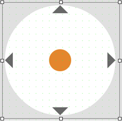
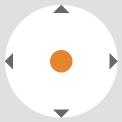
Widget "Joystick" allows two value changes (x-value and y-value) via a slider thumb. The user can move the slider thumb in all x- and y-directions within the circle.
For additional information about the widget, see here.
IMPORTANT: If the connection to the HMI application is interrupted, it must be ensured by the application that all connected variables are set to 0! For information about how to check the connection, see section Remote OPC UA connection status.
The following properties cannot be used in compound widget "Mapping":
zIndex, left, top, height, width
Appearance
|
|
Editor |
Web browser |
Properties
Type |
Description |
Bindable |
Necessary |
Default value |
|
Defines the usability of the widget. A disabled widget (enable=false) does not react to user interaction and does not trigger events. The "enable" behavior is inherited from the container widgets to the child widgets. |
|
|
true |
||
left |
Absolute position measured from the left border of the surrounded element (e.g. container widget or content). |
|
|
|
|
top |
Absolute position measured from the top border of the surrounded element (e.g. container widget or content). |
|
|
|
|
permissionOperate |
Defines the roles that are permitted to use the widget. For roles without sufficient rights, the widget does not react to user interaction and does not trigger events. |
|
|
|
|
permissionView |
Defines the roles that are permitted to see the widget. For roles without sufficient rights, the widget is hidden. |
|
|
|
|
Reference to a customizable widget style. |
|
|
default |
||
Defines the visibility of the widget. The widget can be hidden with visible=false. (visible = true, hidden = false). The "visible" behavior is inherited from the container widget to the child widgets. |
|
|
true |
||
width |
Defines the total width of the widget in pixels. A value in % refers to the width of the surrounding element. |
|
|
250 |
|
height |
Defines the total height of the widget in pixels. A value in % refers to the height of the surrounding element. |
|
|
250 |
|
zIndex determines the z-order of the widget. With overlapping widgets, the zIndex determines which widget is on the top and which one is on the bottom. The widget with the larger zIndex is on top, and the one with the smaller zIndex is on the bottom. The zIndex must be unique within a piece of content or a container widget. The zIndex is automatically assigned by the visual editor and can therefore be changed via the toolbar. |
|
|
|
||
Defines the value on the x-axis. Only write access to the source (binding mode "Init read/write"). |
|
|
0 |
||
Defines the value on the y-axis. Only write access to the source (binding mode "Init read/write"). |
|
|
0 |
||
decimalPlaces |
Defines the decimal places of properties xValue and yValue. |
|
|
2 |
|
trackSize |
Defines the width of the slider track. |
|
|
7px |
|
thumbSize |
Defines the size of the slider thumb. |
|
|
50px |
|
Relative path to an image that is displayed on the slider thumb. For more information, see here. |
|
|
|
||
showIndicator |
Defines whether the arrows are displayed on the right or left or at the top or bottom. |
|
|
true |
|
tooltip |
Defines the text that should appear as information when the tooltip indicator is pressed. You can use a static text or a text from the text system. For more information, see here. Mode "Tooltip" must be enabled for this. There are two different options for this: •Using action "ShowTooltip" •Using action "Client system" ShowTooltips. |
|
|
|
|
tabIndex |
Property tabIndex is used to manage the tab order during keyboard operation. For additional information, see Keyboard operation. ENTER triggers event Click if tabIndex ≥0. It is not possible to operate widget Joystick with the keyboard. |
|
|
-1 |
Styleable properties
Type |
Description |
Default value |
|
backColor |
Defines the background color of the widget. |
#EDEDED |
|
backGround |
Defines a relative path to an image to be used as the background. |
|
|
backGroundGradient |
Defines the background color of the widget as a color gradient. |
|
|
borderStyle |
Defines the style of the border around the widget. Borders can be unbroken, dashed or dotted. |
none |
|
borderWidth |
Defines the width of the border around the widget. |
0px |
|
borderColor |
Defines the color of the border around the widget. |
#000000 |
|
opacity |
Defines the transparency of the widget. The lower the value, the more transparent the widget. |
1 |
|
margin |
Defines the offset of the external boundary of the widget to the widget's actual set position. For more information, see here. |
0px |
|
thumbColor |
Defines the background color of the slider thumb. |
#FF8800 |
|
thumbGradient |
Defines the background color of the slider thumb as a color gradient. |
|
|
trackColor |
Defines the background color of the widget's slider track. |
#FFFFFF |
|
trackGradient |
Defines the background color of the widget slider track as a color gradient. |
|
|
disabledBackColor |
Defines the background color of the widget in the disabled state. |
#FFFFFF |
|
disabledBackGroundGradient |
Defines the background color of the widget as a color gradient in the disabled state. |
|
|
disabledThumbColor |
Defines the background color of the slider thumb in the disabled state. |
#F1F1F1 |
|
disabledThumbGradient |
Defines the background color of the slider thumb as a color gradient in the disabled state. |
|
|
disabledTrackColor |
Defines the background color of the widget's slider track in the disabled state. |
#FFFFFF |
|
disabledTrackGradient |
Defines the background color of the widget slider track in the disabled state as a color gradient. |
|
|
disabledIndicatorColor |
Defines the background color of the arrows in the disabled state. |
#EAEAEA |
|
indicatorColor |
Defines the color of the arrows. |
#333333 |

