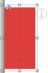
Widget "InfoBanner" is a container with a definable size that provides a visual transition when opening and closing. This container can be placed anywhere on a piece of content.
Any widget (except another "InfoBanner" widget) can be placed on widget "InfoBanner".
The button that is visible in the editor for opening and closing widget "InfoBanner" is not displayed at runtime. The InfoBanner must be opened or closed at runtime with actions (Open, Close).
For more information about container or child widgets, see Definition of container/child widgets.
The following properties cannot be used in compound widget "Mapping":
zIndex, left, top, height, width
Appearance
|
|
Editor |
Web browser |
Properties
Type |
Description |
Bindable |
Necessary |
Default value |
|
Defines the usability of the widget. A disabled widget (enable=false) does not react to user interaction and does not trigger events. The "enable" behavior is inherited from the container widgets to the child widgets. |
|
|
true |
||
Defines the visibility of the widget. The widget can be hidden with visible=false. (visible = true, hidden = false). The "visible" behavior is inherited from the container widget to the child widgets. |
|
|
true |
||
permissionOperate |
Defines the roles that are permitted to use the widget. For roles without sufficient rights, the widget does not react to user interaction and does not trigger events. |
|
|
|
|
permissionView |
Defines the roles that are permitted to see the widget. For roles without sufficient rights, the widget is hidden. |
|
|
|
|
Reference to a customizable widget style. |
|
|
default |
||
zIndex determines the z-order of the widget. With overlapping widgets, the zIndex determines which widget is on the top and which one is on the bottom. The widget with the larger zIndex is on top, and the one with the smaller zIndex is on the bottom. The zIndex must be unique within a piece of content or a container widget. The zIndex is automatically assigned by the visual editor and can therefore be changed via the toolbar. |
|
|
|
||
left |
Absolute position measured from the left border of the surrounded element (e.g. container widget or content). |
|
|
|
|
top |
Absolute position measured from the top border of the surrounded element (e.g. container widget or content). |
|
|
|
|
height |
Defines the total height of the widget in pixels. A value in % refers to the height of the surrounding element. |
|
|
200 |
|
width |
Defines the total width of the widget in pixels. A value in % refers to the width of the surrounding element. |
|
|
100 |
|
tooltip |
Defines the text that should appear as information when the tooltip indicator is pressed. You can use a static text or a text from the text system. For more information, see here. Mode "Tooltip" must be enabled for this. There are two different options for this: •Using action "ShowTooltip" •Using action "Client system" ShowTooltips. |
|
|
|
|
docking |
Defines the position of the widget. Possible values: left: Positions the widget on the left edge of the page. right: Positions the widget on the right edge of the page. bottom: Positions the widget on the bottom edge of the page. top: Positions the widget on the top edge of the page. |
|
|
bottom |
|
autoClose |
Defines whether window "InfoBanner" closes automatically when clicking outside the widget. (automatically close = true, do not automatically close = false) Interacting with a widget within "InfoBanner" during "autoCloseTime" disables automatic closing. Clicking outside of widget "InfoBanner" closes it again. |
|
|
false |
|
autoCloseTime |
Defines the time (ms) after widget "InfoBanner" is automatically closed. If autoCloseTime = 0, the window is not closed automatically. |
|
|
0 |
|
transitionOpenTime |
Defines the time (ms) that widget "InfoBanner" uses to open a visual transition. |
|
|
0 |
|
transitionCloseTime |
Defines the time (ms) that widget "InfoBanner" uses to close a visual transition. |
|
|
0 |
|
showOnTop |
Defines the behavior of widget "InfoBanner". true: Widget "InfoBanner" is placed in front of all other widgets regardless of its zIndex. All widgets underneath and on top of widget "InfoBanner" will be covered up. A projected shadow (styleable property"shadow") is not displayed at runtime. false: Widget "InfoBanner" is placed depending on its zIndex. Widgets on top of widget "InfoBanner" can cover it up. |
|
|
false |
|
tabIndex |
Property tabIndex is used to manage the tab order during keyboard operation. For additional information, see Keyboard operation. ENTER triggers event Click if tabIndex ≥0. |
|
|
-1 |
Styleable properties
type |
description |
defaultValue |
|
backColor |
Defines the background color of the widget. |
Transparent |
|
backGroundGradient |
Defines the background color of the widget as a color gradient. |
|
|
borderStyle |
Defines the style of the border around the widget. Borders can be unbroken, dashed or dotted. |
solid |
|
borderColor |
Defines the color of the border around the widget. |
#000000 |
|
borderWidth |
Defines the width of the border around the widget. |
1px |
|
cornerRadius |
Defines the corner style of the widget. |
0px |
|
opacity |
Defines the transparency of the widget. The lower the value, the more transparent the widget. |
1 |
|
shadow |
Defines the shadow of the widget. If property showOnTop=true, the shadow is displayed on the piece of content even if widget InfoBanner is not open. |
none |

