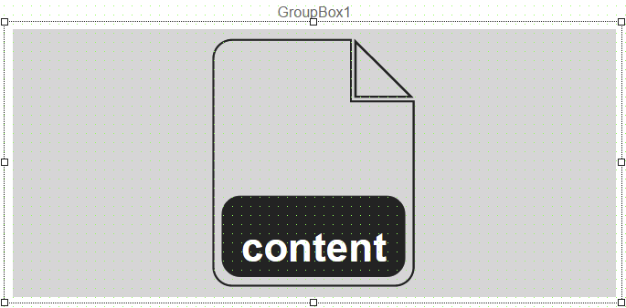
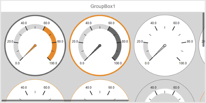
Widget "ContentControl" allows a piece of content to be loaded into a widget.
It is transparent and has no styleable properties.
The widget provides actions to load content at a later time. ClientSystem event "ContentLoaded" can be used to react to loading content. If the piece of content to be loaded is larger than the widget, the widget provides scrollbars. The content can also be scaled as an alternative.
Widget "ContentControl" can only be placed within a GroupBox, TabItem or FlexBoxItem.
Contents containing widget "FlyOut", "InfoBanner", "ContentControl" or "ContentCarousel" cannot be used in this widget!
The following properties cannot be used in compound widget "Mapping":
zIndex, left, top, height, width
Appearance
|
|
Editor |
Web browser |
Properties
Type |
Description |
Bindable |
Necessary |
Default value |
|
contentId |
Defines the piece of content that is to be initially loaded. This piece of content is loaded immediately after loading the widget. |
|
|
|
|
deactivate |
Defines whether a piece of content that has been loaded is disabled if the widget becomes invisible. If false: The loaded content stays enabled if "ContentControl" becomes invisible. This means that all bindings and event bindings for the piece of content stay enabled. If true: The loaded content is disabled if "ContentControl" becomes invisible. This means that all bindings and event bindings for the piece of content are disabled. The content is re-enabled if "ContentControl" becomes visible again. |
|
|
false |
|
permissionView |
Defines the roles that are permitted to see the widget. For roles without sufficient rights, the widget is hidden. |
|
|
|
|
Defines the visibility of the widget. The widget can be hidden with visible=false. (visible = true, hidden = false). The "visible" behavior is inherited from the container widget to the child widgets. |
|
|
true |
||
zoomMode |
Defines whether the piece of content loaded in "ContentControl" should be scaled. For additional information, see here. |
|
|
original |
|
zIndex determines the z-order of the widget. With overlapping widgets, the zIndex determines which widget is on the top and which one is on the bottom. The widget with the larger zIndex is on top, and the one with the smaller zIndex is on the bottom. The zIndex must be unique within a piece of content or a container widget. The zIndex is automatically assigned by the visual editor and can therefore be changed via the toolbar. |
|
|
|
||
left |
Absolute position measured from the left border of the surrounded element (e.g. container widget or content). |
|
|
|
|
top |
Absolute position measured from the top border of the surrounded element (e.g. container widget or content). |
|
|
|
|
width |
Defines the total width of the widget in pixels. A value in % refers to the width of the surrounding element. |
|
|
|
|
height |
Defines the total height of the widget in pixels. A value in % refers to the height of the surrounding element. |
|
|
|

