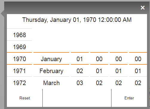
Widget "DateTimePicker" is used to set the clock or time. This widget cannot be added manually, but it is used internally by DateTimeInput.
This widget is used and bound internally by other widgets. It therefore cannot be configured directly on a piece of content, but styles can be used for it.
Appearance
|
Web browser |
Styleable properties
Type |
Description |
Default value |
|
cornerRadius |
Defines the corner style of the widget. |
0px |
|
headerGradient |
Defines the background color of the widget header as a color gradient. |
|
|
borderColor |
Defines the color of the border around the widget. |
#333333 |
|
textColor |
Defines the color used to display the text. |
#000000 |
|
opacity |
Defines the transparency of the widget. The lower the value, the more transparent the widget. |
1 |
|
fontName |
Defines the font used for the text shown. |
Arial |
|
shadow |
Defines the shadow of the widget. |
none |
|
backColor |
Defines the background color of the widget. |
#333333 |
|
backGroundGradient |
Defines the background color of the widget as a color gradient. |
|
|
mouseDownBackColor |
Defines the background color of the widget while the widget is being pressed. |
#FF8800 |
|
mouseDownTextColor |
Defines the color used to display the text while the widget is being pressed. |
#FFFFFF |
|
buttonBackGroundGradient |
Defines the background color of the buttons as a color gradient. |
|
|
buttonMouseDownBackGroundGradient |
Defines the background color of the buttons when pressed as a color gradient. |
|
|
lineColor |
Defines the color of the dividing line between numbers. |
#d4d4d4 |
|
activeLineColor |
Color of the line surrounding the top and bottom of the current selection. |
#FF8800 |
