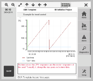
Widget "VNCViewer" provides a VNC client that can be used to establish a connection to an external VNC server.
The proxy must be configured in the mapp View server configuration in order for widget VNCViewer to establish connections.
License 1TGMPVNCVIEW.20-01 is required for widget VNCViewer. For additional information, see Licensing.
The resolution configured on the VNC server affects the amount of data being transferred and therefore also the transfer rate.
The following is valid for mapp View versions < 5.7:
•Supported RFB protocol version: 3.3
•Supported pixel format: 32 bits per pixel
For mapp View versions > 5.7, all RFB protocol versions are supported.
The following properties cannot be used in compound widget "Mapping":
zIndex, left, top, height, width
Appearance
|
|
Editor |
Web browser |
Properties
Type |
Description |
Bindable |
Necessary |
Default value |
|
permissionOperate |
Defines the roles that are permitted to use the widget. For roles without sufficient rights, the widget does not react to user interaction and does not trigger events. |
|
|
|
|
permissionView |
Defines the roles that are permitted to see the widget. For roles without sufficient rights, the widget is hidden. |
|
|
|
|
Defines the IP address or hostname of the VNC server. |
|
|
localhost |
||
Defines the port number of the VNC server. |
|
|
5900 |
||
Defines the password used for the connection. No value is entered if a password should not be used. |
|
|
|
||
Defines whether the widget automatically tries to establish a connection after initialization (true). If false, a window for establishing a connection is displayed. |
|
|
true |
||
showControlBar |
Defines whether a control bar is displayed at the top of the widget (true). |
|
|
true |
|
controlBarHeight |
Defines the height of the control bar. |
|
|
50 |
|
Reference to a customizable widget style. |
|
|
default |
||
Defines the usability of the widget. A disabled widget (enable=false) does not react to user interaction and does not trigger events. The "enable" behavior is inherited from the container widgets to the child widgets. |
|
|
true |
||
Defines the visibility of the widget. The widget can be hidden with visible=false. (visible = true, hidden = false). The "visible" behavior is inherited from the container widget to the child widgets. |
|
|
true |
||
zIndex determines the z-order of the widget. With overlapping widgets, the zIndex determines which widget is on the top and which one is on the bottom. The widget with the larger zIndex is on top, and the one with the smaller zIndex is on the bottom. The zIndex must be unique within a piece of content or a container widget. The zIndex is automatically assigned by the visual editor and can therefore be changed via the toolbar. |
|
|
|
||
left |
Absolute position measured from the left border of the surrounded element (e.g. container widget or content). |
|
|
|
|
top |
Absolute position measured from the top border of the surrounded element (e.g. container widget or content). |
|
|
|
|
width |
Defines the total width of the widget in pixels. A value in % refers to the width of the surrounding element. |
|
|
640 |
|
height |
Defines the total height of the widget in pixels. A value in % refers to the height of the surrounding element. |
|
|
480 |
|
tooltip |
Defines the text that should appear as information when the tooltip indicator is pressed. You can use a static text or a text from the text system. For more information, see here. Mode "Tooltip" must be enabled for this. There are two different options for this: •Using action "ShowTooltip" •Using action "Client system" ShowTooltips. |
|
|
|
|
tabIndex |
Property tabIndex is used to manage the tab order during keyboard operation. For additional information, see Keyboard operation. ENTER triggers event Click if tabIndex ≥0. It is not possible to operate widget VNCViewer with the keyboard. |
|
|
-1 |
Styleable properties
Type |
Description |
Default value |
|
borderWidth |
Defines the width of the border around the widget. |
0px |
|
cornerRadius |
Defines the corner style of the widget. |
0px |
|
borderColor |
Defines the color of the border around the widget. |
#000000 |
|
borderStyle |
Defines the style of the border around the widget. Borders can be unbroken, dashed or dotted. |
none |
|
backColor |
Defines the background color of the widget. |
#DBDBDB |
|
controlBarBorderWidth |
Defines the width of the control bar's border. |
0px |
|
controlBarCornerRadius |
Defines the corner style of the control bar. |
0px |
|
controlBarBorderColor |
Defines the color of the control bar's border. |
#000000 |
|
controlBarBorderStyle |
Defines the style of the control bar's border. |
none |
|
controlBarBackColor |
Defines the background color of the control bar. |
#F1F1F1 |
|
margin |
Defines the offset of the external boundary of the widget to the widget's actual set position. For more information, see here. |
0px |
|
opacity |
Defines the transparency of the widget. The lower the value, the more transparent the widget. |
1 |
|
shadow |
Defines the shadow of the widget. |
none |

