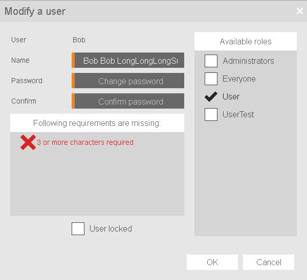
Widget UserListDialog is not visible in the Widget Catalog but can only be configured via widget UserList. This dialog box is displayed when editing and adding users. The following styleable properties are available for the dialog box of widget UserList.
Styleable properties
Type |
Description |
Default value |
|
closeImage |
Defines the image for the close button in the header. |
|
|
showCloseButton |
Defines whether the close button is displayed. |
true |
|
cornerRadius |
Defines the corner style of the widget. |
0px |
|
backColor |
Defines the background color of the widget. |
#FFFFFF |
|
backGroundGradient |
Defines the background color of the widget as a color gradient. |
|
|
borderColor |
Defines the color of the border around the widget. |
#333333 |
|
borderWidth |
Defines the width of the border around the widget. |
9px |
|
borderStyle |
Defines the style of the border around the widget. Borders can be unbroken, dashed or dotted. |
solid |
|
opacity |
Defines the transparency of the widget. The lower the value, the more transparent the widget. |
1 |
|
headerTextColor |
Defines the color used to display the text in the header. |
#FFFFFF |
|
headerFontName |
Defines the font used to display the text in the header. |
Arial |
|
headerFontSize |
Defines the size of the font used to display the text in the header. |
16px |
|
headerBold |
Defines whether the text in the header is displayed in bold. |
false |
|
headerItalic |
Defines whether the text in the header is displayed in italics. |
false |
|
headerGradient |
Defines the background color of the header as a color gradient. |
|
|
headerBackColor |
Defines the background color of the header. |
#333333 |
|
headerBorderColor |
Defines the color of the header frame. |
#333333 |
|
headerBorderWidth |
Defines the width of the header frame. |
0px |
|
headerBorderStyle |
Defines the style of the header frame. Borders can be unbroken, dashed or dotted. |
none |
|
headerHeight |
Defines the total height of the header. |
42px |
|
policySuccessTextColor |
Defines the color of the text used in the password policy dialog box if the policies are successful. |
#008000 |
|
policyFailTextColor |
Defines the color of the text used in the password policy dialog box if the policies failed. |
#FF0000 |
|
policyFontName |
Defines the font used for the text of the password policy dialog box. |
Arial |
|
policyFontSize |
Defines the size of the text used for the password policy dialog box. |
14px |
|
policyBold |
Defines whether the text used in the password policy dialog box is displayed in bold. |
false |
|
policyItalic |
Defines whether the text used in the password policy dialog box is displayed in italics. |
false |
|
policySuccessImageColor |
Defines the color of the image used in the widget if the policies are successful. |
#008000 |
|
policySuccessImageSize |
Defines the size of the image used in the widget if the policies are successful. |
16px |
|
policyFailImageColor |
Defines the color of the image used in the widget if the policies failed. |
#FF0000 |
|
policyFailImageSize |
Defines the size of the image in the widget when the policy failed. |
16px |
The available styleable properties can be used if configuring the widget within a style. For an example demonstrating how to create this style for a similar widget, see here.
