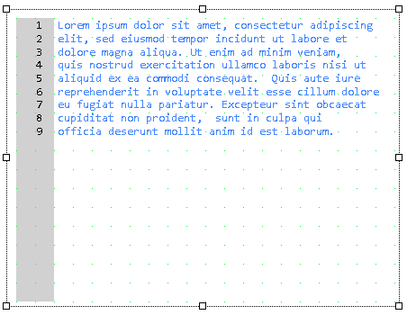
Widget "TextPad" is used as a text editor.
The text pad offers functions for editing generic text files directly from the mapp View HMI application. It allows editing and saving text files with advanced functions such as keyboard shortcuts, search/replace and many others.
|
Our B&R Tutorial Portal includes a tutorial on widget TextPad (GER/ENG). (access data) |
To use this widget, library MpServer must be present on the target system. "MpServer" is used for internal communication. For more information, see here.
The MpFileManager configuration must be used for this widget. A mapp Link does not need to be specified; the connection between widget and configuration is created automatically!
Files larger than 15 MB may take longer to display in the widget.
The following properties cannot be used in compound widget "Mapping":
zIndex, left, top, height, width
Appearance
|
|
Editor |
Web browser |
Properties
Type |
Description |
Bindable |
Necessary |
Default value |
|
permissionOperate |
Defines the roles that are permitted to use the widget. For roles without sufficient rights, the widget does not react to user interaction and does not trigger events. |
|
|
|
|
permissionView |
Defines the roles that are permitted to see the widget. For roles without sufficient rights, the widget is hidden. |
|
|
|
|
Defines the usability of the widget. A disabled widget (enable=false) does not react to user interaction and does not trigger events. The "enable" behavior is inherited from the container widgets to the child widgets. |
|
|
true |
||
Defines the visibility of the widget. The widget can be hidden with visible=false. (visible = true, hidden = false). The "visible" behavior is inherited from the container widget to the child widgets. |
|
|
true |
||
top |
Absolute position measured from the top border of the surrounded element (e.g. container widget or content). |
|
|
|
|
left |
Absolute position measured from the left border of the surrounded element (e.g. container widget or content). |
|
|
|
|
width |
Defines the total width of the widget in pixels. A value in % refers to the width of the surrounding element. |
|
|
400 |
|
height |
Defines the total height of the widget in pixels. A value in % refers to the height of the surrounding element. |
|
|
300 |
|
zIndex determines the z-order of the widget. With overlapping widgets, the zIndex determines which widget is on the top and which one is on the bottom. The widget with the larger zIndex is on top, and the one with the smaller zIndex is on the bottom. The zIndex must be unique within a piece of content or a container widget. The zIndex is automatically assigned by the visual editor and can therefore be changed via the toolbar. |
|
|
|
||
keyboard |
Defines whether widget "TextKeyPad" is used as an on-screen keyboard for input. If keyboard=true, "MotionKeyPad" is used and opens automatically as soon as input is required in widget "TextPad". If keyboard=false, it must be ensured that a hardware keyboard is available. |
|
|
false |
|
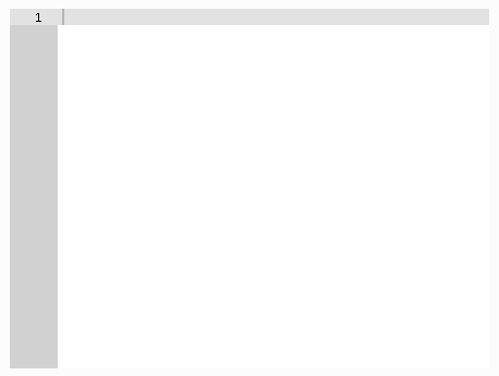
showLineNumber |
Defines whether line numbering is displayed on the left margin. If showLineNumber=true, the line numbers are displayed; if false, no line numbers are displayed. |
|
|
true |
|
Reference to a customizable widget style. |
|
|
default |
||
tooltip |
Defines the text that should appear as information when the tooltip indicator is pressed. You can use a static text or a text from the text system. For more information, see here. Mode "Tooltip" must be enabled for this. There are two different options for this: •Using action "ShowTooltip" •Using action "Client system" ShowTooltips. |
|
|
|
|
tabIndex |
Property tabIndex is used to manage the tab order during keyboard operation. For additional information, see Keyboard operation. ENTER triggers event Click if tabIndex ≥0. Operating widget TextPad with buttons is possible in principle, but is not yet supported with the pure button operation of the HMI application. |
|
|
-1 |
Styleable properties
Type |
Description |
Default value |
|
borderColor |
Defines the color of the border around the widget. |
#DFDFDF |
|
borderStyle |
Defines the style of the border around the widget. Borders can be unbroken, dashed or dotted. |
none |
|
borderWidth |
Defines the width of the border around the widget. |
1px |
|
margin |
Defines the offset of the external boundary of the widget to the widget's actual set position. For more information, see here. |
0px |
|
shadow |
Defines the shadow of the widget. |
none |
|
fontName |
Defines the font used for the text shown. Monospaced fonts should be used for correct cursor alignment. For additional information, see here. If the font is not installed on the client, it can be added and manged in a mapp View font package. This is automatically provided to the client when the HMI application is requested. |
Courier New |
|
fontSize |
Defines the size of the font used to display the text. |
12px |
|
textColor |
Defines the color used to display the text. |
#000000 |
|
gutterTextColor |
Defines the color used to display the text in the text margin. |
#000000 |
|
backColor |
Defines the background color of the editable area of the widget. |
#FFFFFF |
|
selectionBackColor |
Defines the background color of the selected text. |
#FF8800 |
|
activeLineBackColor |
Defines the background color of the line on which the cursor is placed. |
#E2E2E2 |
|
gutterBackColor |
Defines the background color of the numbering bar on the left side. |
#D1D1D1 |
|
activeGutterBackColor |
Defines the background color of the row in the numbering bar on which the cursor is placed. |
#E2E2E2 |