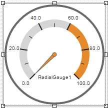
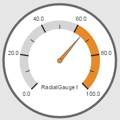
Widget "RadialGauge" is used to display a numerical value in a gauge with a pointer.
The following properties cannot be used in compound widget "Mapping":
zIndex, left, top, height, width
Appearance
|
|
Editor |
Web browser |
Properties
Type |
Description |
Bindable |
Necessary |
Default value |
|
Defines the usability of the widget. A disabled widget (enable=false) does not react to user interaction and does not trigger events. The "enable" behavior is inherited from the container widgets to the child widgets. |
|
|
true |
||
Defines the number format for the widget. |
|
|
{'metric':{ 'decimalPlaces' : 1, 'minimumIntegerDigits' : 1 }, 'imperial' :{ 'decimalPlaces' : 1, 'minimumIntegerDigits' : 1 }, 'imperial-us' :{ 'decimalPlaces' : 1, 'minimumIntegerDigits' : 1 }} |
||
majorTicks |
Number of major ticks. |
|
|
5 |
|
maxValue |
Defines the maximum permissible value for value binding. With node binding, the "high" attribute for the EU range from the OPC UA variable is used. |
|
|
100 |
|
minValue |
Defines the minimum permissible value for value binding. With node binding, the "low" attribute for the EU range from the OPC UA variable is used. |
|
|
0 |
|
minorTicks |
Number of minor ticks. |
|
|
1 |
|
Value with unit for node binding. |
|
|
|
||
permissionOperate |
Defines the roles that are permitted to use the widget. For roles without sufficient rights, the widget does not react to user interaction and does not trigger events. |
|
|
|
|
permissionView |
Defines the roles that are permitted to see the widget. For roles without sufficient rights, the widget is hidden. |
|
|
|
|
range |
Defines the length of the radial area (beginning at startAngle), where the values between minValue and maxValue are distributed. Valid range: 0 to 360 |
|
|
270 |
|
Start of the first scaling area. A scaling area is displayed as a background color on the chart. This is defined as a percentage of the entire scaling. |
|
|
0 |
||
End of the first scaling area. A scaling area is displayed as a background color on the chart. This value is also used as the start of the second scaling area. This is defined as a percentage of the entire scaling. |
|
|
20 |
||
End of the second scaling area. A scaling area is displayed as a background color on the chart. This value is also used as the start of the third scaling area. This is defined as a percentage of the entire scaling. |
|
|
40 |
||
End of the third scaling area. A scaling area is displayed as a background color on the chart. This value is also used as the start of the fourth scaling area. This is defined as a percentage of the entire scaling. |
|
|
60 |
||
End of the fourth scaling area. A scaling area is displayed as a background color on the chart. This value is also used as the start of the fifth scaling area. This is defined as a percentage of the entire scaling. |
|
|
80 |
||
End of the fifth scaling area. A scaling area is displayed as a background color on the chart. This is defined as a percentage of the entire scaling. |
|
|
100 |
||
scaleAreaInPercent |
Defines if the values for property "scaleArea" are interpreted as a percentage. |
|
|
true |
|
showUnit |
Defines whether the unit should be displayed. A node binding is necessary for this. |
|
|
false |
|
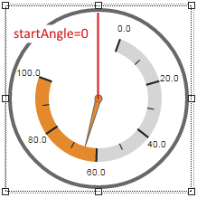
startAngle |
Defines the starting angle at which the radial range begins. Valid range: 0 to 359 In this image, startAngle uses value 20: |
|
|
225 |
|
Reference to a customizable widget style. |
|
|
default |
||
text |
Static text or a text from the text system that is shown on the widget. A localized text is defined by specifying $IAT/Textkey. A maximum text length exists for this widget. If this is exceeded, the text is cut off at this position. |
|
|
|
|
transitionTime |
Defines the time (ms) the pointer needs to move to a new position when a value changes. |
|
|
500 |
|
Defines the unit code of the widget. |
|
|
|
||
Defines the value displayed by the widget. |
|
|
0 |
||
Defines the visibility of the widget. The widget can be hidden with visible=false. (visible = true, hidden = false). The "visible" behavior is inherited from the container widget to the child widgets. |
|
|
true |
||
zIndex determines the z-order of the widget. With overlapping widgets, the zIndex determines which widget is on the top and which one is on the bottom. The widget with the larger zIndex is on top, and the one with the smaller zIndex is on the bottom. The zIndex must be unique within a piece of content or a container widget. The zIndex is automatically assigned by the visual editor and can therefore be changed via the toolbar. |
|
|
|
||
left |
Absolute position measured from the left border of the surrounded element (e.g. container widget or content). |
|
|
|
|
top |
Absolute position measured from the top border of the surrounded element (e.g. container widget or content). |
|
|
|
|
height |
Defines the total height of the widget in pixels. A value in % refers to the height of the surrounding element. |
|
|
200 |
|
width |
Defines the total width of the widget in pixels. A value in % refers to the width of the surrounding element. |
|
|
200 |
|
tooltip |
Defines the text that should appear as information when the tooltip indicator is pressed. You can use a static text or a text from the text system. For more information, see here. Mode "Tooltip" must be enabled for this. There are two different options for this: •Using action "ShowTooltip" •Using action "Client system" ShowTooltips. |
|
|
|
|
tabIndex |
Property tabIndex is used to manage the tab order during keyboard operation. For additional information, see Keyboard operation. ENTER triggers event Click if tabIndex ≥0. |
|
|
-1 |
Styleable properties
Type |
Description |
Default value |
|
borderWidth |
Defines the width of the border around the widget. |
0px |
|
borderColor |
Defines the color of the border around the widget. |
#000000 |
|
borderStyle |
Defines the style of the border around the widget. Borders can be unbroken, dashed or dotted. |
solid |
|
backColor |
Defines the background color of the widget. |
#FFFFFF |
|
shadow |
Defines the shadow of the widget. |
none |
|
margin |
Defines the offset of the external boundary of the widget to the widget's actual set position. For more information, see here. |
0px |
|
backGroundGradient |
Defines the background color of the widget as a color gradient. |
|
|
backGround |
Defines a relative path to an image to be used as the background. |
|
|
backColorScaleArea1 |
Defines the background color of the first scaling area of the widget. |
Transparent |
|
backColorScaleArea2 |
Defines the background color of the second scaling area of the widget. |
Transparent |
|
backColorScaleArea3 |
Defines the background color of the third scaling area of the widget. |
Transparent |
|
backColorScaleArea4 |
Defines the background color of the fourth scaling area of the widget. |
Transparent |
|
backColorScaleArea5 |
Defines the background color of the fifth scaling area of the widget. |
Transparent |
|
pointerBackColor |
Defines the background color of the pointer. |
#FFFFFF |
|
pointerPathColor |
Defines the color of the pointer's border. |
#000000 |
|
pointerPathWidth |
Defines the width of the pointer's border. |
1px |
|
textColor |
Defines the color used to display the text. |
#000000 |
|
fontSize |
Defines the size of the font used to display the text. |
10px |
|
fontName |
Defines the font used for the text shown. |
Arial |


