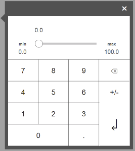
Widget "NumPad" is used to enter numerical values.
This widget is used and bound internally by other widgets. It therefore cannot be configured directly on a piece of content, but styles can be used for it.
The widget's orientation can be defined under the respective parent widget (e.g. widget "NumericInput").
Appearance
|
Web browser |
Styleable properties
Type |
Description |
Default value |
|
cornerRadius |
Defines the corner style of the widget. |
0px |
|
backColor |
Defines the background color of the widget. |
#FFFFFF |
|
backGroundGradient |
Defines the background color of the widget as a color gradient. |
|
|
headerGradient |
Defines the color of the header as a color gradient. |
|
|
borderColor |
Defines the color of the border around the widget. |
#333333 |
|
textColor |
Defines the color used to display the text. |
#000000 |
|
mouseDownBackColor |
Defines the background color of the widget while the widget is being pressed. |
#FFA800 |
|
mouseDownTextColor |
Defines the color used to display the text while the widget is being pressed. |
#000000 |
|
buttonBackGroundGradient |
Defines the background color of the buttons as a color gradient. |
|
|
buttonMouseDownBackGroundGradient |
Defines the background color of the buttons when the buttons are pressed. |
|
|
opacity |
Defines the transparency of the widget. The lower the value, the more transparent the widget. |
1 |
|
fontName |
Defines the font used for the text shown. |
Arial |
|
shadow |
Defines the shadow of the widget. |
none |
|
sliderForeColor |
Defines the color of the widget's slider. |
#FFF |
|
sliderForeGroundGradient |
Defines the color of the widget's slider as a color gradient. |
|
|
sliderOutputBackColor |
Defines the background color of the widget's slider. |
Transparent |
|
valueBorderWidth |
Defines the width of the border around the value display. |
1px |
|
valueBackGroundGradient |
Defines the background color of the value display as a color gradient. |
|
|
valueBorderStyle |
Defines the style of the border around the value display. Borders can be unbroken, dashed or dotted. |
solid |
|
valueBorderColor |
Defines the color of the border around the value display. |
#333333 |
|
valueBackColor |
Defines the background color of the value display. |
#FFFFFF |
|
valueCornerRadius |
Defines the rounding of the corners around the value display. |
0px |
|
valueFontName |
Defines the font used for the text of the value display shown. |
Arial |
|
valueFontSize |
Defines the size used of the text of the value display shown. |
18px |
|
valueTextColor |
Defines the color used to display the text of the value display. |
#000000 |
|
valueShadow |
Defines the shadow of the value display. |
none |
|
valueTextAlign |
Defines the orientation of the value in the value display. |
left |
|
showSlider |
Defines whether the Numpad uses a slider for the value change and value display (default=true) or only a value display without a slider (false). |
true |
|
showMinMax |
Defines whether the Numpad displays the limits (default=true) or hides them (false). |
true |
|
imageEnterBackground |
Optional image displayed instead of the Enter character. PNG and SVG images can be referenced. NOTE: The color information must be contained in the SVG element (fillColor). |
|
|
mouseDownImageEnterBackground |
Optional image for the pressed Enter key displayed instead of the Enter character. PNG and SVG images can be referenced. NOTE: The color information must be contained in the SVG element (fillColor). |
|
|
imageDeleteBackground |
Optional image displayed instead of the Delete character. PNG and SVG images can be referenced. NOTE: The color information must be contained in the SVG element (fillColor). |
|
|
mouseDownImageDeleteBackground |
Optional image for the pressed Delete key displayed instead of the Delete character. PNG and SVG images can be referenced. NOTE: The color information must be contained in the SVG element (fillColor). |
|
|
buttonMargin |
Defines the distance between the button widgets. |
0px |
|
buttonCornerRadius |
Defines the rounding of the corners around the button widgets. |
0px |
|
buttonBorderColor |
Defines the color of the border around the button widgets. |
#333333 |
|
buttonMouseDownBorderColor |
Defines the color of the border around the button widgets as long as they are pressed. |
#333333 |
|
buttonBorderWidth |
Defines the width of the buttons' border. |
1px |
|
buttonBackColor |
Defines the background color of the button. |
#FFFFFF |
