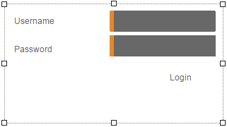
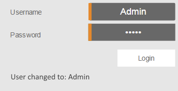
Widget "Login" makes it possible to log into the mapp View server with a username and password. It contains all widgets needed to enter the username and password. The widget also displays information about successful and failed logins.
This widget should only be used if the HMI application is output via "https" (TLS); otherwise, the integrity of the data is not ensured.
After successful authentication on the client, all permissions for the role(s) assigned to the user applied to the widget.
The following properties cannot be used in compound widget "Mapping":
zIndex, left, top, height, width
Appearance
|
|
Editor |
Web browser |
Properties
Type |
Description |
Bindable |
Necessary |
Default value |
|
autFailMessage |
Defines the message displayed after a failed login. This text is displayed underneath the login button. |
|
|
Authorization failed |
|
buttonLabel |
Defines the text shown on the login button. |
|
|
Login |
|
buttonStyle |
Reference to a customizable widget style. This style is used for the login button. |
|
|
default |
|
Defines the usability of the widget. A disabled widget (enable=false) does not react to user interaction and does not trigger events. The "enable" behavior is inherited from the container widgets to the child widgets. |
|
|
true |
||
enableUserInput |
Defines whether a username can be entered or not. |
|
|
true |
|
labelStyle |
Reference to a customizable widget style. This style is applied to properties "passwordLabel" and "userLabel". |
|
|
default |
|
messageStyle |
Reference to a customizable widget style. This style is used for the message text, e.g. on failed login. This text is displayed underneath the login button. |
|
|
default |
|
passwordInputStyle |
Reference to a customizable widget style. This style is used for entering the password. |
|
|
default |
|
passwordLabel |
Description of the password input field. It is displayed left of the password field. |
|
|
Password |
|
permissionOperate |
Defines the roles that are permitted to use the widget. For roles without sufficient rights, the widget does not react to user interaction and does not trigger events. |
|
|
|
|
permissionView |
Defines the roles that are permitted to see the widget. For roles without sufficient rights, the widget is hidden. |
|
|
|
|
setUserFailMessage |
This text is displayed if a user logs in with a correct username and password but an error still occurs during login. This text is displayed underneath the login button. Note: This property is currently not supported. |
|
|
Set user failed |
|
setUserSuccessMessage |
Message text displayed after a user has logged in successfully. This message is displayed only briefly. The message from property userChangedMessage is then displayed. This text is displayed underneath the login button. |
|
|
Login successful |
|
Reference to a customizable widget style. |
|
|
default |
||
userChangedMessage |
Message text displayed after switching users successfully. This text is displayed underneath the login button. |
|
|
User switched to: |
|
userInputStyle |
Reference to a customizable widget style. This style is used for entering the username. |
|
|
default |
|
userLabel |
Description of the username input field. It is displayed left of the username field. |
|
|
Username |
|
userName |
Specifies the predefined username. This text is displayed automatically in the username input field. |
|
|
|
|
Defines the visibility of the widget. The widget can be hidden with visible=false. (visible = true, hidden = false). The "visible" behavior is inherited from the container widget to the child widgets. |
|
|
true |
||
zIndex determines the z-order of the widget. With overlapping widgets, the zIndex determines which widget is on the top and which one is on the bottom. The widget with the larger zIndex is on top, and the one with the smaller zIndex is on the bottom. The zIndex must be unique within a piece of content or a container widget. The zIndex is automatically assigned by the visual editor and can therefore be changed via the toolbar. |
|
|
|
||
left |
Absolute position measured from the left border of the surrounded element (e.g. container widget or content). |
|
|
|
|
top |
Absolute position measured from the top border of the surrounded element (e.g. container widget or content). |
|
|
|
|
height |
Defines the total height of the widget in pixels. A value in % refers to the height of the surrounding element. |
|
|
160 |
|
width |
Defines the total width of the widget in pixels. A value in % refers to the width of the surrounding element. |
|
|
300 |
|
keyboard |
Defines whether an on-screen keyboard is used for entries. If keyboard=true, an on-screen keyboard is used and opens automatically as soon as input is required in the widget. If keyboard=false, it must be ensured that a hardware keyboard is available. |
|
|
true |
|
tooltip |
Defines the text that should appear as information when the tooltip indicator is pressed. You can use a static text or a text from the text system. For more information, see here. Mode "Tooltip" must be enabled for this. There are two different options for this: •Using action "ShowTooltip" •Using action "Client system" ShowTooltips. |
|
|
|
|
tabIndex |
Property tabIndex is used to manage the tab order during keyboard operation. For additional information, see Keyboard operation. ENTER triggers event Click when tabIndex ≥0; if ENTER is pressed on the login button, the user is logged in with the entered username and password. |
|
|
0 |
Styleable properties
type |
description |
defaultValue |
|
borderStyle |
Defines the style of the border around the widget. Borders can be unbroken, dashed or dotted. |
none |
|
borderWidth |
Defines the width of the border around the widget. |
2px |
|
cornerRadius |
Defines the corner style of the widget. |
0px |
|
backColor |
Defines the background color of the widget. |
Transparent |
|
backGroundGradient |
Defines the background color of the widget as a color gradient. |
|
|
borderColor |
Defines the color of the border around the widget. |
#5B7C70 |
|
opacity |
Defines the transparency of the widget. The lower the value, the more transparent the widget. |
1 |
|
margin |
Defines the offset of the external boundary of the widget to the widget's actual set position. For more information, see here. |
0px |
|
shadow |
Defines the shadow of the widget. |
none |