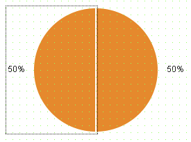
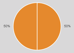
Widget "PieChartItem" makes it possible to display numerical values in a circular graph. The widget must be added to widget "PieChart" for this (provides the container for the pie chart).
The following properties cannot be used in compound widget "Mapping":
zIndex, left, top
Appearance
|
|
Editor |
Web browser |
Properties
Type |
Description |
Bindable |
Necessary |
Default value |
|
Defines the value of the widget. |
|
|
50 |
||
Value with unit for node binding. The value is shown in the information box when clicking on the widget. |
|
|
|
||
Defines the usability of the widget. A disabled widget (enable=false) does not react to user interaction and does not trigger events. The "enable" behavior is inherited from the container widgets to the child widgets. |
|
|
true |
||
permissionOperate |
Defines the roles that are permitted to use the widget. For roles without sufficient rights, the widget does not react to user interaction and does not trigger events. |
|
|
|
|
permissionView |
Defines the roles that are permitted to see the widget. For roles without sufficient rights, the widget is hidden. |
|
|
|
|
Static text or a text from the text system that is shown on the widget. A localized text is defined by specifying $IAT/Textkey. The text is shown in the information box when clicking on the widget. |
|
|
|
||
Reference to a customizable widget style. |
|
|
default |
||
Defines the visibility of the widget. The widget can be hidden with visible=false. (visible = true, hidden = false). The "visible" behavior is inherited from the container widget to the child widgets. |
|
|
true |
||
zIndex determines the z-order of the widget. With overlapping widgets, the zIndex determines which widget is on the top and which one is on the bottom. The widget with the larger zIndex is on top, and the one with the smaller zIndex is on the bottom. The zIndex must be unique within a piece of content or a container widget. The zIndex is automatically assigned by the visual editor and can therefore be changed via the toolbar. |
|
|
|
Styleable properties
Type |
Description |
Default value |
|
backColor |
Defines the background color of the widget. |
#FF8800 |
|
opacity |
Defines the transparency of the widget. The lower the value, the more transparent the widget. |
1 |

