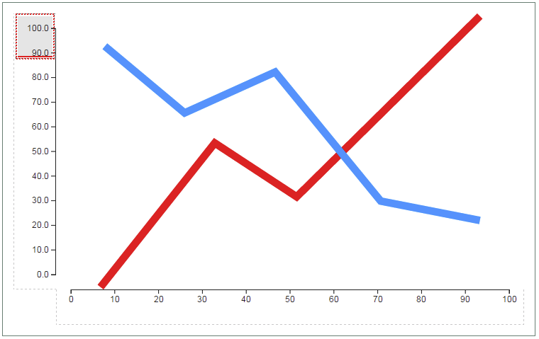
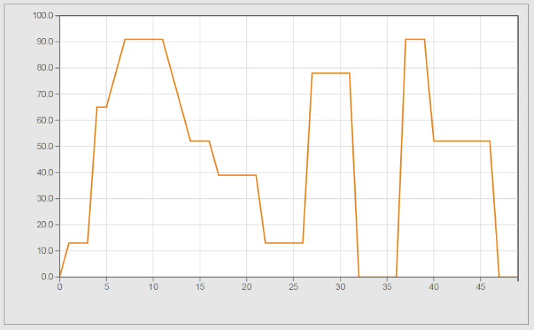
Widget "LineChartGraph" represents the binding for the data to be displayed.
Widget "LineChartGraph" corresponds to a data buffer (e.g. speed). If an additional data buffer should be displayed (e.g. position), then another "LineChartGraph" widget is needed.
The following properties cannot be used in compound widget "Mapping":
zIndex
Appearance
|
|
Editor |
Web browser |
Properties
Type |
Description |
Bindable |
Necessary |
Default value |
|
Current value with unit pointed at by the cursor |
|
|
|
||
Current value pointed at by the cursor |
|
|
|
||
Defines the usability of the widget. A disabled widget (enable=false) does not react to user interaction and does not trigger events. The "disabled..." style is displayed at runtime. The "enable" behavior is inherited from the container widgets to the child widgets. |
|
|
true |
||
maxValue |
Defines the maximum permissible value for value binding. With node binding, the "high" attribute for the EU range from the OPC UA variable is used. Limits the maximum value of the y-axis. |
|
|
100 |
|
minValue |
Defines the minimum permissible value for value binding. With node binding, the "low" attribute for the EU range from the OPC UA variable is used. Limits the minimum value of the y-axis. |
|
|
0 |
|
interpolationType |
Defines the interpolation function to be applied on the graph. |
|
|
linear |
|
Binding for numerical values with a unit. |
|
|
|
||
Reference to a customizable widget style. |
|
|
default |
||
Binding for an array of numerical values. |
|
|
|
||
Defines the visibility of the widget. The widget can be hidden with visible=false. (visible = true, hidden = false). The "visible" behavior is inherited from the container widget to the child widgets. |
|
|
true |
||
References the widget to an X-axis using the ID. |
|
|
|
||
zIndex determines the z-order of the widget. With overlapping widgets, the zIndex determines which widget is on the top and which one is on the bottom. The widget with the larger zIndex is on top, and the one with the smaller zIndex is on the bottom. The zIndex must be unique within a piece of content or a container widget. The zIndex is automatically assigned by the visual editor and can therefore be changed via the toolbar. |
|
|
|
||
Defines the number of values that should be drawn in widget "LineChart". |
|
|
-1 |
||
intersectionPointSize |
Defines the size of the intersection where the graph and the cursor intersect. |
|
|
10px |
Styleable properties
Type |
Description |
Default value |
|
lineColor |
Defines the color of the graphs. |
#FF0000 |
|
disabledLineColor |
Defines the color of the graphs in the disabled state. |
#DDDDDD |
|
lineWidth |
Defines the thickness of the graphs. |
2px |
|
fillColor |
Defines the color used to display the area below a graph. |
Transparent |
|
disabledFillColor |
Defines the color used to display the area below a graph when the widget is disabled. |
Transparent |
|
intersectionPointColor |
Defines the color of the intersection where the graph and the cursor intersect. |
#FFBB88 |
|
activeIntersectionPointColor |
Defines the color of the intersection where the graph and cursor intersect in an active state. |
#FF8800 |
|
disabledIntersectionPointColor |
Defines the color of the intersection where the graph and the cursor intersect in a disabled state. |
#EEEEEE |

