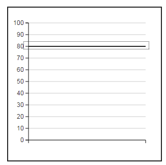
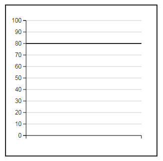
Widget "BarChartThreshold" displays a horizontal line as a reference value behind the "BarChartItem" widgets. In addition, it makes it possible to display a window that displays a range instead of a single line.
The following properties cannot be used in compound widget "Mapping":
zIndex
Appearance
|
|
Editor |
Web browser |
Properties
Type |
Description |
Bindable |
Necessary |
Default value |
|
permissionView |
Defines the roles that are permitted to see the widget. For roles without sufficient rights, the widget is hidden. |
|
|
|
|
permissionOperate |
Defines the roles that are permitted to use the widget. For roles without sufficient rights, the widget does not react to user interaction and does not trigger events. |
|
|
|
|
Reference to a customizable widget style. |
|
|
default |
||
Defines the usability of the widget. A disabled widget (enable=false) does not react to user interaction and does not trigger events. The "enable" behavior is inherited from the container widgets to the child widgets. |
|
|
true |
||
Defines the visibility of the widget. The widget can be hidden with visible=false. (visible = true, hidden = false). The "visible" behavior is inherited from the container widget to the child widgets. |
|
|
true |
||
zIndex determines the z-order of the widget. With overlapping widgets, the zIndex determines which widget is on the top and which one is on the bottom. The widget with the larger zIndex is on top, and the one with the smaller zIndex is on the bottom. The zIndex must be unique within a piece of content or a container widget. The zIndex is automatically assigned by the visual editor and can therefore be changed via the toolbar. |
|
|
|
||
Defines the value of the y-axis on which the reference line is displayed. |
|
|
80 |
||
Defines the value of the y-axis with unit on which the reference line is displayed. |
|
|
|
||
Threshold value with unit relative to value. The threshold value specifies the size of the window above and below the line. Only a positive value is permitted. |
|
|
|
||
Threshold value relative to value. The threshold value specifies the size of the window above and below the line. Only a positive value is permitted. |
|
|
0 |
||
useWindowRange |
Defines whether the threshold values of property window or properties windowLow and windowHigh are displayed. |
|
|
false |
|
Defines the size of the threshold window below the line if property useWindowRange=true. |
|
|
75 |
||
Defines the size of the threshold window above the line if property useWindowRange=true. |
|
|
80 |
Styleable properties
Type |
Description |
Default value |
|
lineColor |
Defines the color used to display the line in the widget. |
#000000 |
|
lineWidth |
Defines the width of the line in the widget. |
2px |
|
windowFillColor |
Defines the background color of the widget. |
rgba(255, 136, 0, 0.5) |
|
windowLinesColor |
Defines the color used to display the lines of the window in the widget. |
#000000 |
|
windowLinesWidth |
Defines the width of the lines that frame the widget window above and below. |
2px |
|
opacity |
Defines the transparency of the widget. The lower the value, the more transparent the widget. |
1 |

