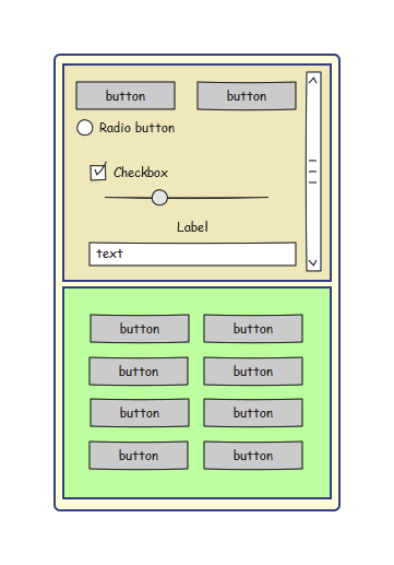
This section includes detailed explanations for the concept of widgets "FlexBox" and "FlexBoxItem".
FlexBox widget
Widget "FlexBox" is a container and defines a framework where the "FlexBoxItem" widgets can be placed. The "FlexBoxItem" widgets that have been placed share the available space in the "FlexBox" widget.
FlexBoxItem widget
Widget "FlexBoxItem" is also a container and defines a framework in which other widgets can be placed. Widget "FlexBoxItem" can change size dynamically in order to adjust to the available space. The maximum size of widget "FlexBoxItem" is determined by the presence of other "FlexBoxItem" widgets (within the same "FlexBox" widget) as well as their configuration (property sizeFactor). For the size of widget "FlexBoxItem" to increase, it must have a sizeFactor > 0; otherwise, it will always keep the size configured in property minSize. A "FlexBoxItem" widget can only be placed in a "FlexBox" widget.
Widget "FlexBoxItem" behaves like widget "GroupBox". If the area available to a "FlexBoxItem" widget is not sufficient for its content, a scrollbar is shown to order to be able to reach the hidden content. The following figure shows a "FlexBox" widget with two "FlexBoxItem" widgets distributed over the space available to the "FlexBox" widget. The top "FlexBoxItem" widget cannot, however, display its content in the area available to it, so a scrollbar is shown.
|
Examples:
Example 1: Property "sizeFactor" has the same value for all "FlexBoxItem" widgets.
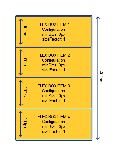
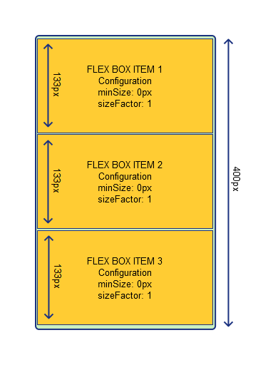
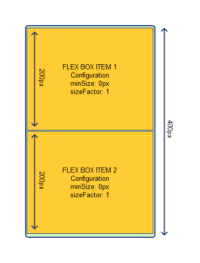
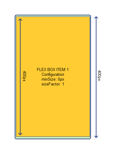
If all the "FlexBoxItem" widgets have the same sizeFactor and it is not equal to 0, the area available for the surrounding "FlexBox" widget is equally divided among the "FlexBoxItem" widgets. In the following images, all "FlexBoxItem" widgets are configured with sizeFactor = 1 and minSize = 0 px. Shows how the remaining FlexBoxItem widgets behave when others are set as invisible.
|
|
|
|
Example 2: Property "sizeFactor" is different for the "FlexBoxItem" widgets.
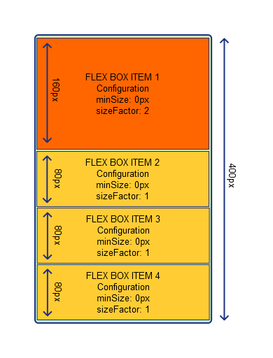
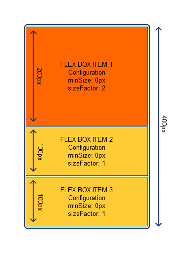
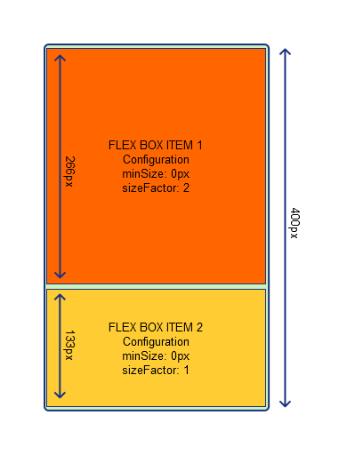
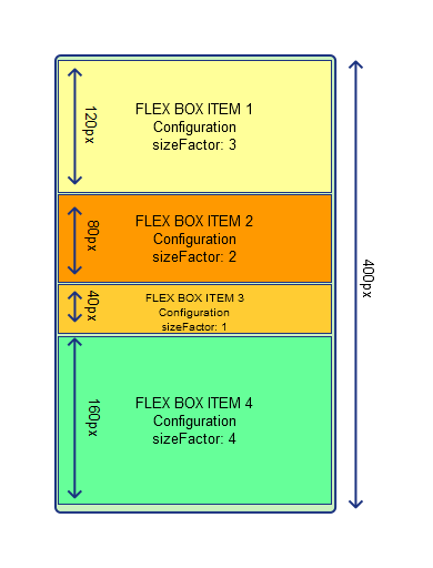
If the value for property sizeFactor is different for the "FlexBoxItem" widgets, the available area is divided among the "FlexBoxItem" widgets. A "FlexBoxItem" widget with a larger sizeFactor is assigned more space than a "FlexBoxItem" widget with a smaller sizeFactor. In the following images, all "FlexBoxItem" widgets are configured with minSize = 0. Three of them were also configured with sizeFactor = 1 and the other with sizeFactor = 2. Shows how the remaining FlexBoxItem widgets behave when others are set as invisible.
|
|
|
Additional clarification about how a different sizeFactor affects the height of widget "FlexBoxItem" (if minSize = 0):
|
Example 3: Interaction between properties minSize and sizeFactor.
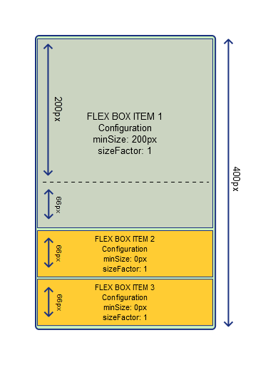
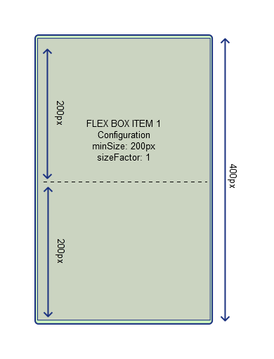
If property minSize is configured for a "FlexBoxItem" widget (minSize > 0), this represents the minimum size of this "FlexBoxItem" widget. It is therefore always as large or larger (if sizeFactor > 0). In the following images, all "FlexBoxItem" widgets are configured with sizeFactor = 1. A "FlexBoxItem" widget was also configured with minSize = 200 px. It is clearly visible how the size of this "FlexBoxItem" widget increases based on sizeFactor as soon as more space becomes available in the surrounding "FlexBox" widget.
|
|
|
|
Example 4: Interaction between properties "sizeFactor" and "transitionTime"
In the following example, widget "FlexBox" contains two "FlexBoxItem" widgets. One "FlexBoxItem" widget should be used for navigation and the actual content should be displayed in the other one. At runtime, navigation should be switched off using a button. An animation should be shown when switching off navigation. This can be done using property transitionTime. "transitionTime" can be set to 500 ms, for example.
As soon as the button is clicked, action SetSizeFactor of widget "FlexBoxItem", which is responsible for navigation, can be triggered. The factor is set to 0 so that navigation is no longer displayed. The specified transitionTime is used to switch off navigation within the defined time.

