This section contains additional information about the concept of widget "HoverButton".
Application examples
The following explains how to use widget "HoverButton". Widgets "GroupBox" and "Image" are also used.
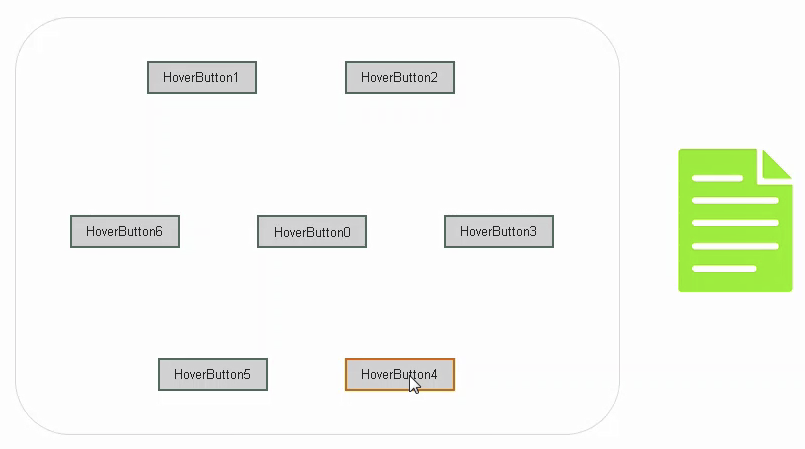
The objective is to display a GroupBox with additional HoverButtons when clicking on a HoverButton.
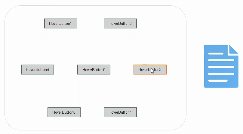
If you hold down the HoverButton and then move to another HoverButton without releasing it, you immediately see a style change (color changes) even though you are still holding down the button.
For example, you can display all possible options visually, and when the GroupBox has closed, save the selected option.
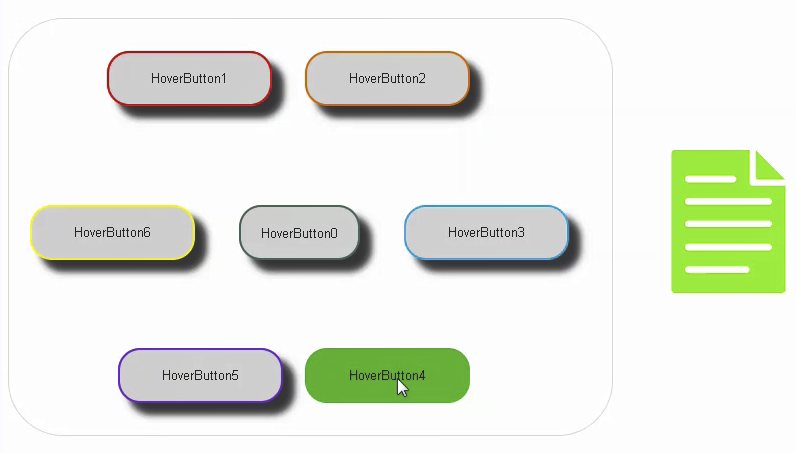
It can look like this, for example:
Using the widgets
•Step 1
Place widget "HoverButton" in the piece of content.
•Step 2
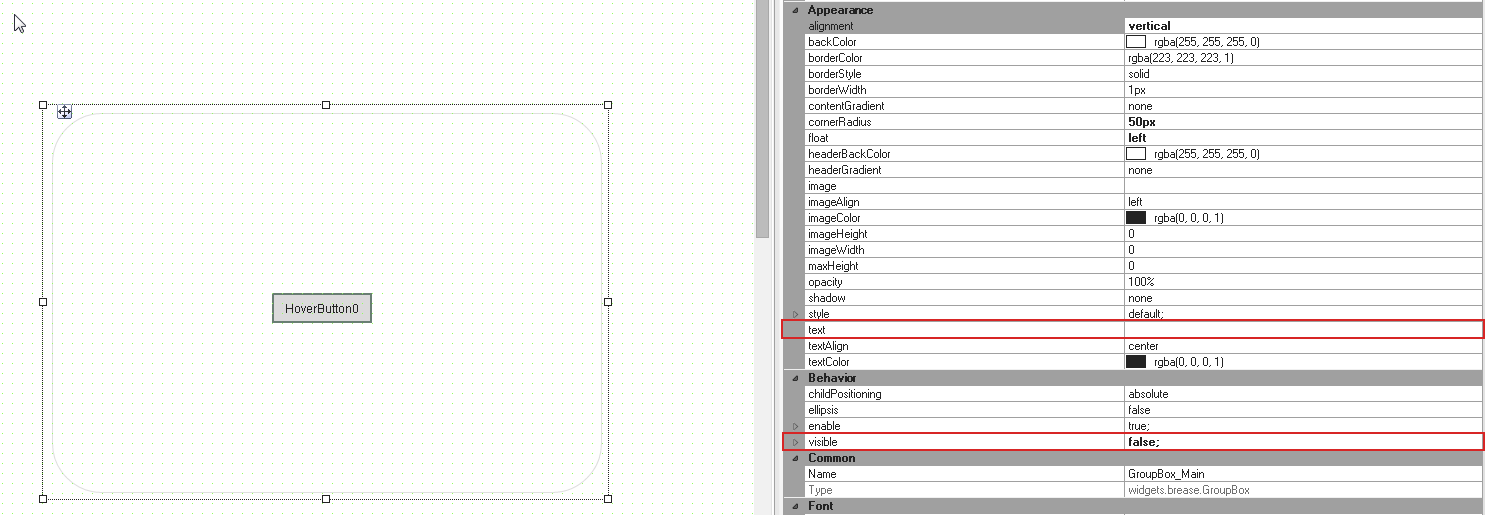
Place widget "GroupBox" from the Widget Catalog above the HoverButton. The HoverButton should not be placed in the GroupBox.
Set the following properties:
- visible= false (This means that the GroupBox is not visible at the beginning.)
- text='' (This will not display the GroupBox header.)
•Step 3
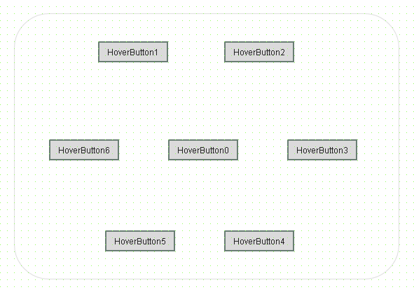
Place widget "HoverButton" from the Widget Catalog in the GroupBox around the 1st HoverButton.
•Step 4
Place widget "Image" from the Widget Catalog next to the GroupBox.
•Step 5
Set up the action/event system:
If you press the middle HoverButton, the GroupBox should set "visible" to "true"; when released, "visible" should be set to "false".
<!--GroupBox Visibility-->
<EventBinding>
<Source xsi:type="widgets.brease.HoverButton.Event" contentRefId="ManTestContent" widgetRefId="HoverButton0" event="MouseDown" />
<EventHandler>
<Action>
<Target xsi:type="widgets.brease.GroupBox.Action" contentRefId="ManTestContent" widgetRefId="GroupBox_Main">
<Method xsi:type="widgets.brease.GroupBox.Action.SetVisible" value="true" />
</Target>
</Action>
</EventHandler>
</EventBinding>
<EventBinding>
<Source xsi:type="widgets.brease.HoverButton.Event" contentRefId="ManTestContent" widgetRefId="HoverButton0" event="MouseUp" />
<EventHandler>
<Action>
<Target xsi:type="widgets.brease.GroupBox.Action" contentRefId="ManTestContent" widgetRefId="GroupBox_Main">
<Method xsi:type="widgets.brease.GroupBox.Action.SetVisible" value="false" />
</Target>
</Action>
</EventHandler>
</EventBinding>
<EventBinding>
<Source xsi:type="widgets.brease.GroupBox.Event" contentRefId="ManTestContent" widgetRefId="GroupBox_Main" event="MouseUp" />
<EventHandler>
<Action>
<Target xsi:type="widgets.brease.GroupBox.Action" contentRefId="ManTestContent" widgetRefId="GroupBox_Main" >
<Method xsi:type="widgets.brease.GroupBox.Action.SetVisible" value="false" />
</Target>
</Action>
</EventHandler>
</EventBinding>
If you move the mouse cursor or your finger one at a time across each of the HoverButtons without letting go, the color of the adjacent image changes immediately. It can look like this, for example:
<!--ImageColor-->
<EventBinding>
<Source xsi:type="widgets.brease.HoverButton.Event" contentRefId="ManTestContent" widgetRefId="HoverButton1" event="MouseDown"/>
<EventHandler>
<Action>
<Target xsi:type="widgets.brease.Image.Action" contentRefId="ManTestContent" widgetRefId="Image1">
<Method xsi:type="widgets.brease.Image.Action.SetStyle" value="red"/>
</Target>
</Action>
</EventHandler>
</EventBinding>
•Step 6
Of course, the styles must be created as well:
<Style xsi:type="widgets.brease.Image" id="red" imageColor='rgba(255, 0, 0, 1)' />
Results
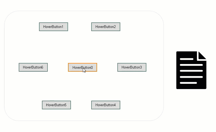
It can look like this when connected to the HMI application:

